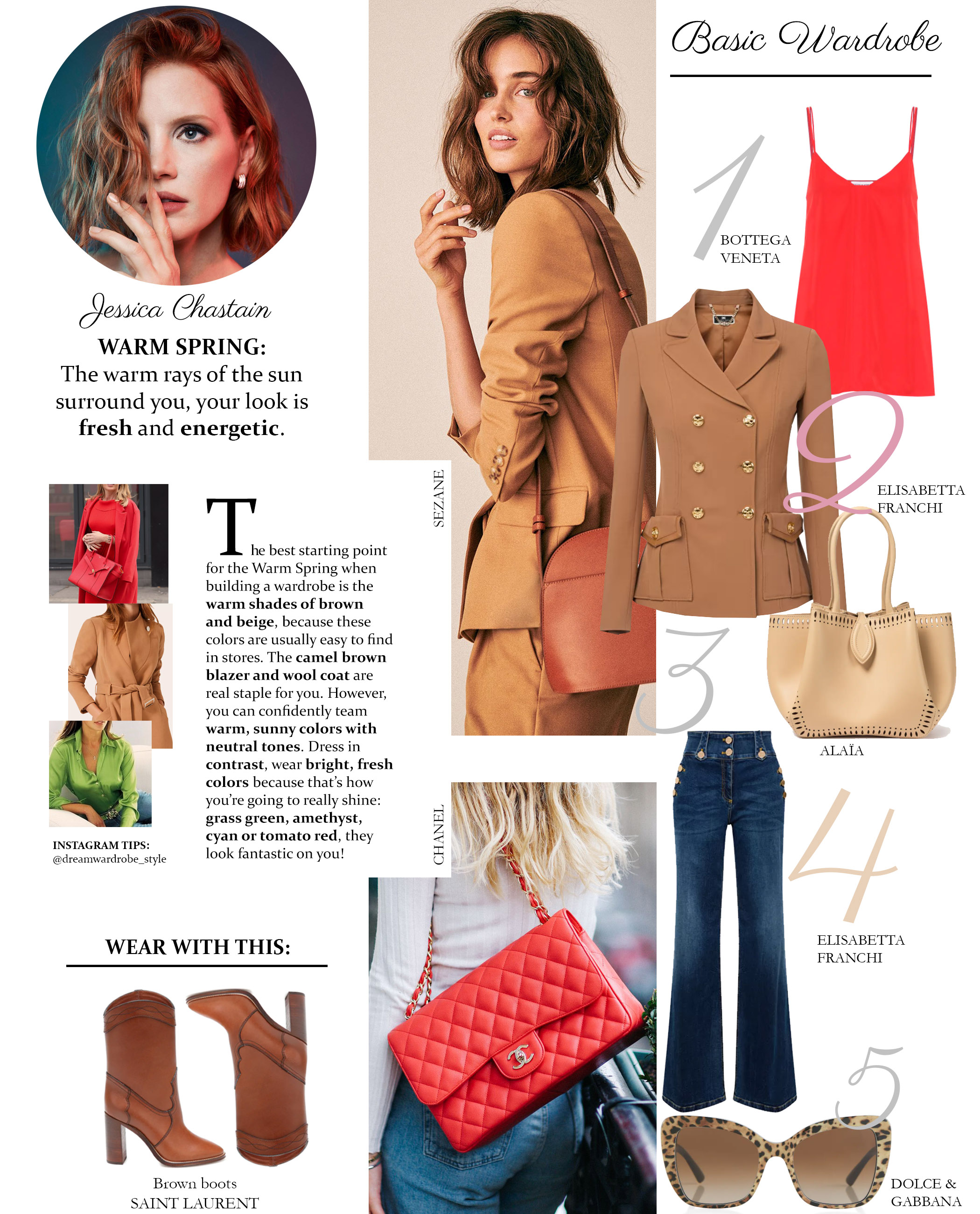
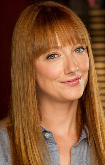
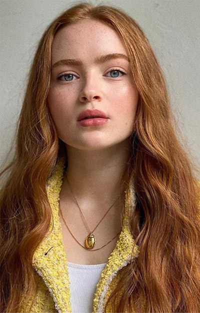
WARM (TRUE) SPRING COLOR PALETTE AND CLOTHING GUIDE
Spring is a season of renewal, marked by blossoming flowers, warmer weather, and a renewed sense of vitality. As the days grow longer and the sun shines brighter, it’s the perfect time to refresh your wardrobe with a vibrant and uplifting color palette.
In this guide, we’ll explore the warm, true spring colors that are sure to brighten your days and complement your natural beauty. From soft pastels to bold hues, we’ll provide you with inspiration and tips on how to incorporate these colors into your everyday outfits. So, let’s dive in and discover the joy of spring’s colorful fashion!
WARM (TRUE) SPRING: WARM + BRIGHT
Warm (True) Spring is one of the three Spring seasons. The warming rays of the sun influence your entire look.
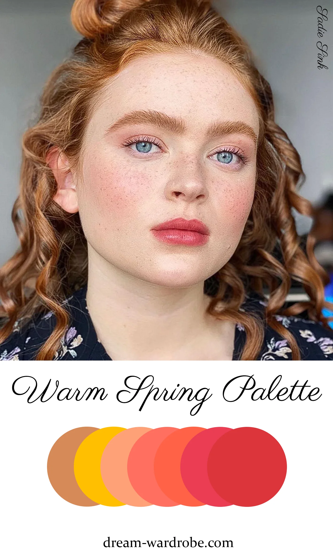
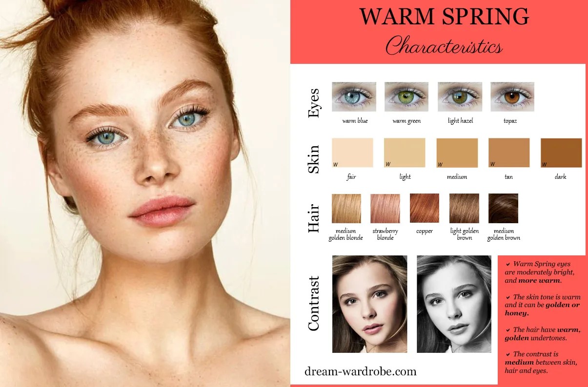
WARM (TRUE) SPRING CHARACTERISTIC
Warm (True) Spring is a high-value season characterized by maximum warmth and vibrant brightness. While it is undoubtedly warm, it also boasts a bright quality. The contrast level between your skin, hair, and eyes is medium. Your eyes can be warm blue, green, light hazel, or topaz. Your skin features golden or honey hues with warm undertones. Your hair, ranging from medium golden blonde through copper to medium golden brown, displays warm or golden tones.
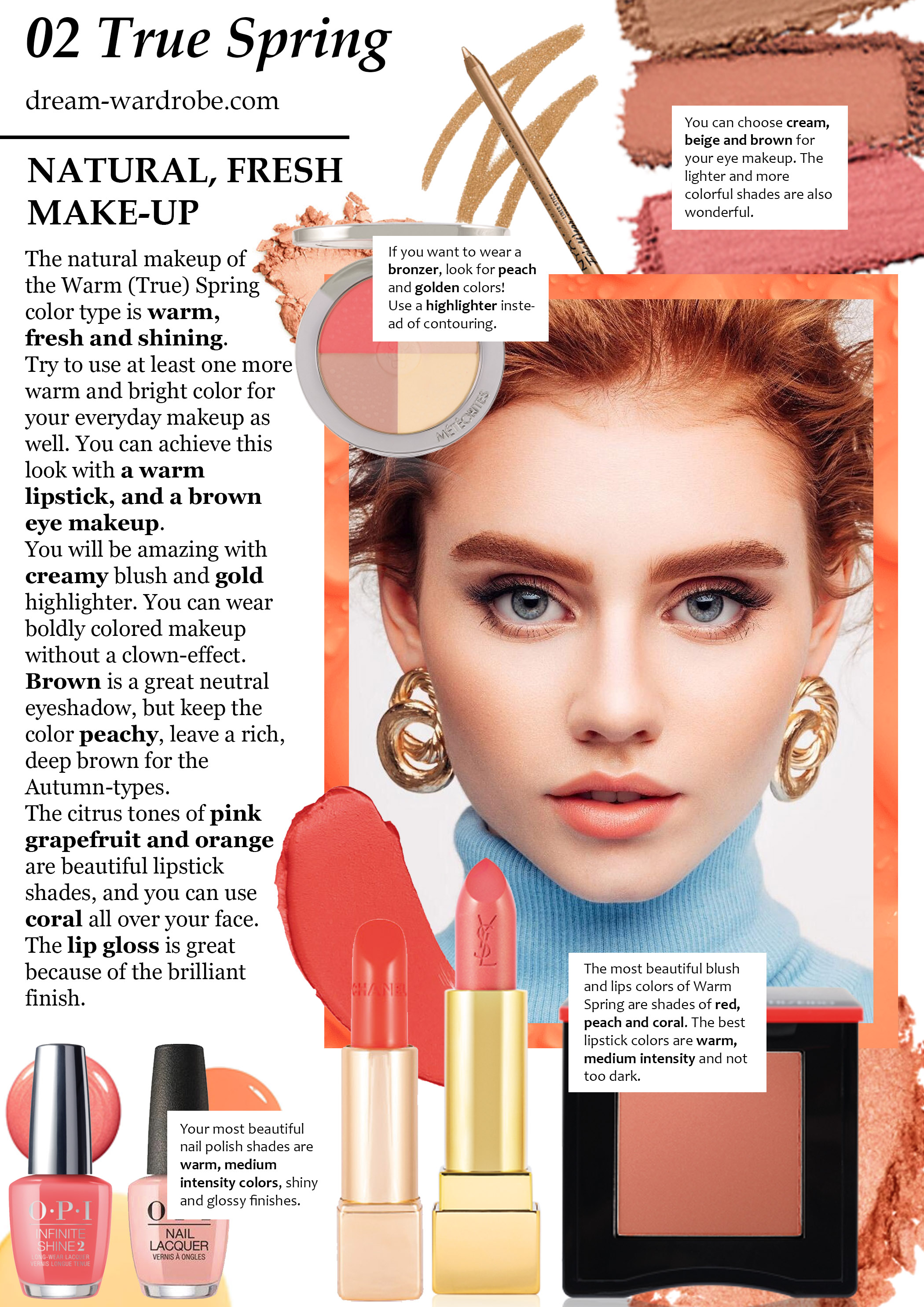
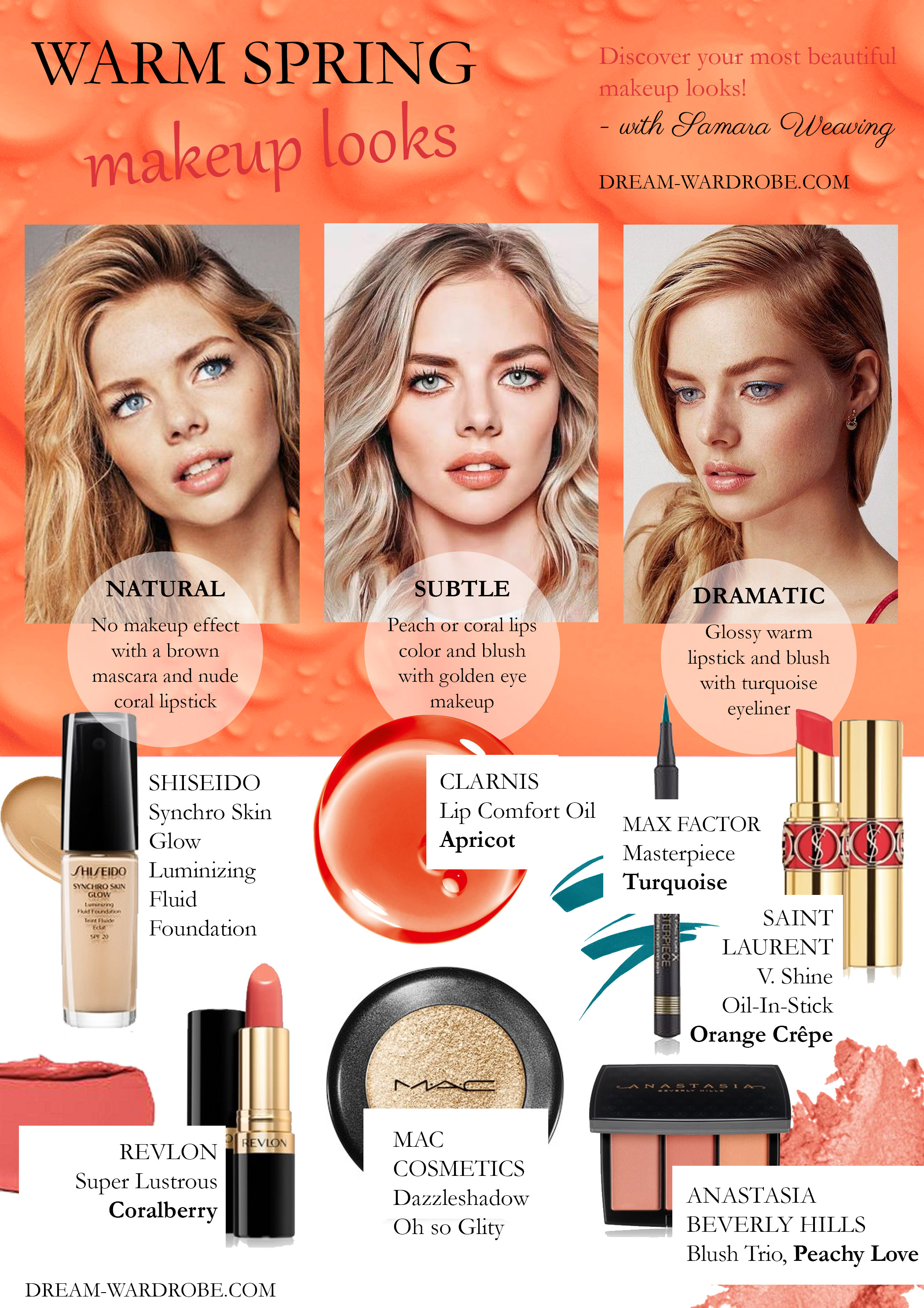
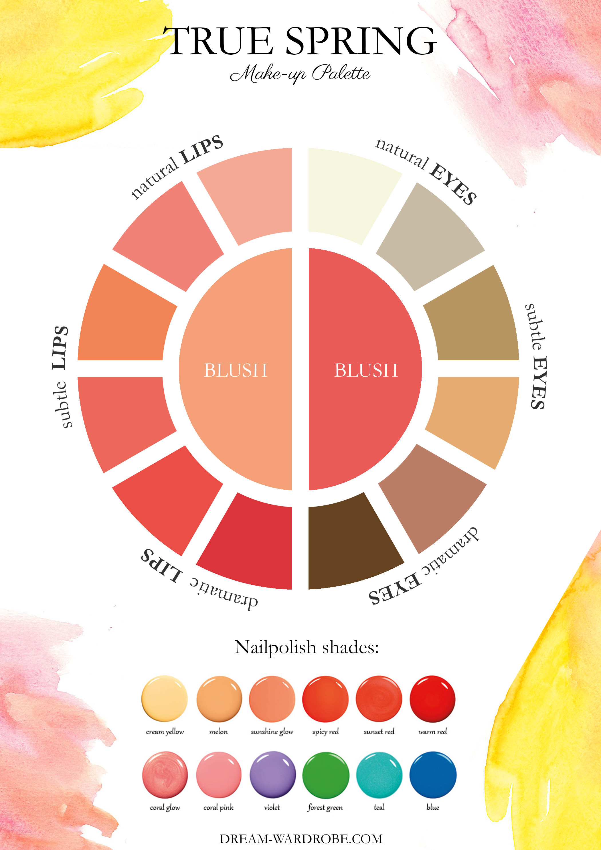
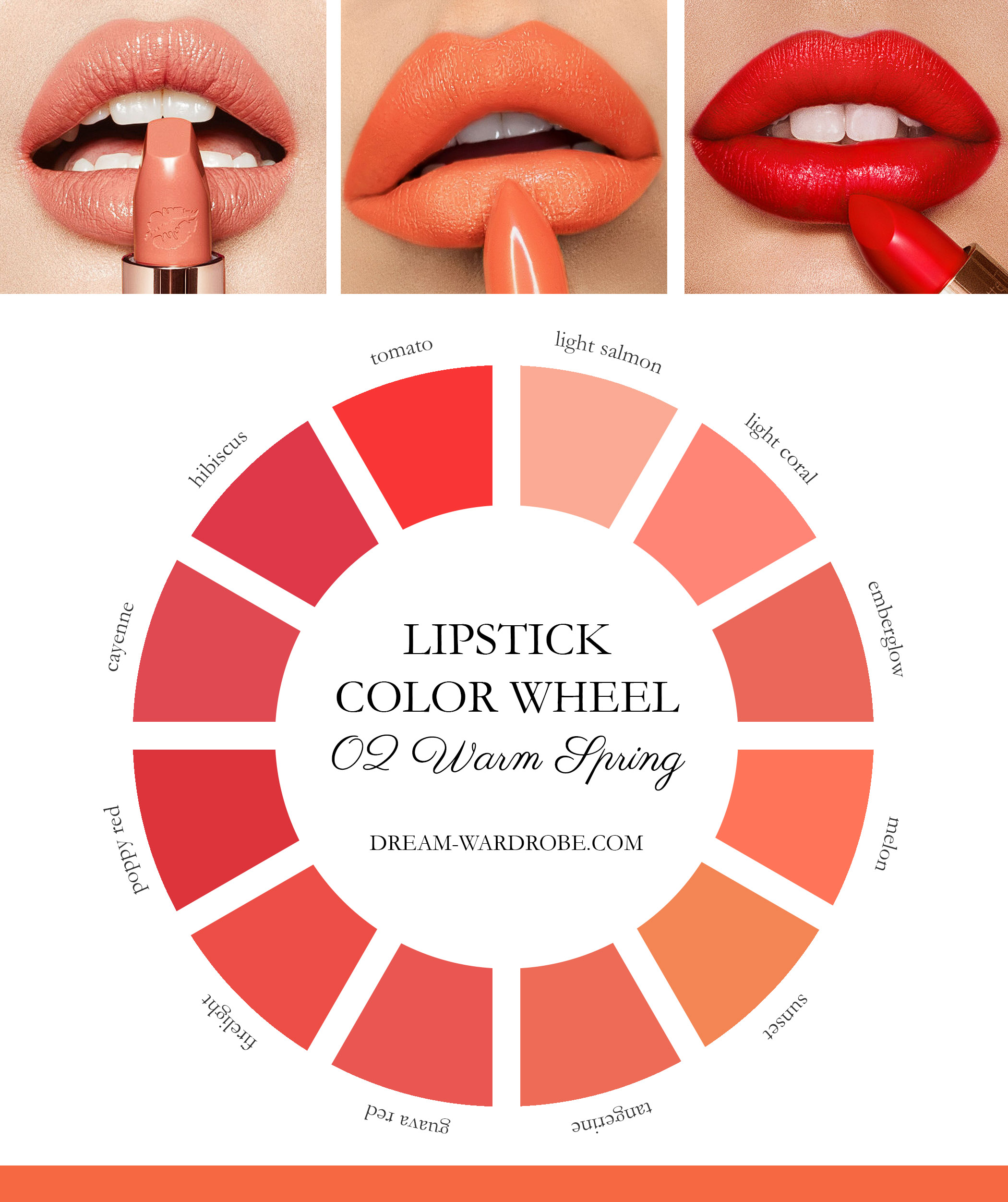
WARM (TRUE) SPRING MAKE-UP
WARM (TRUE) SPRING INSPIRATIONS
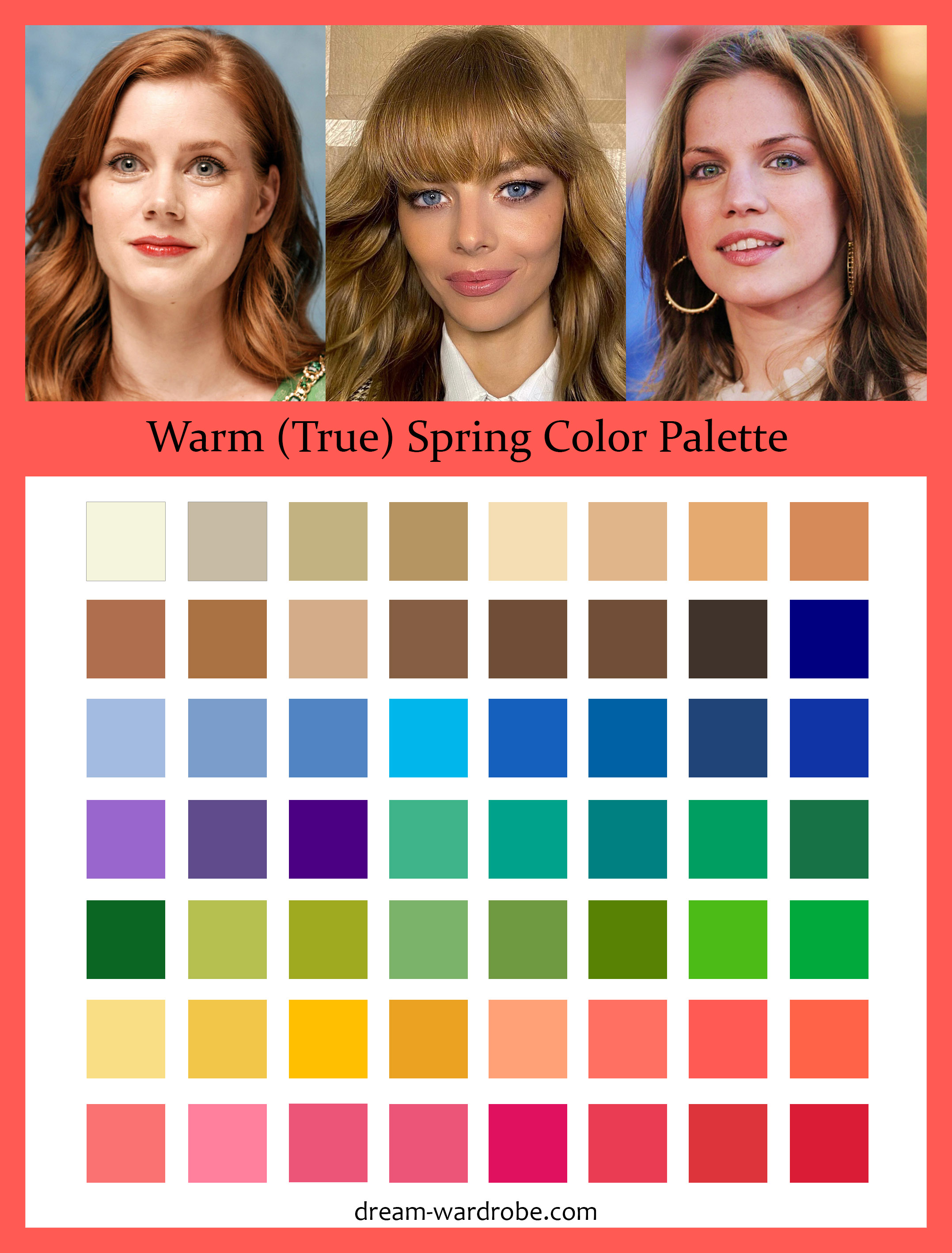
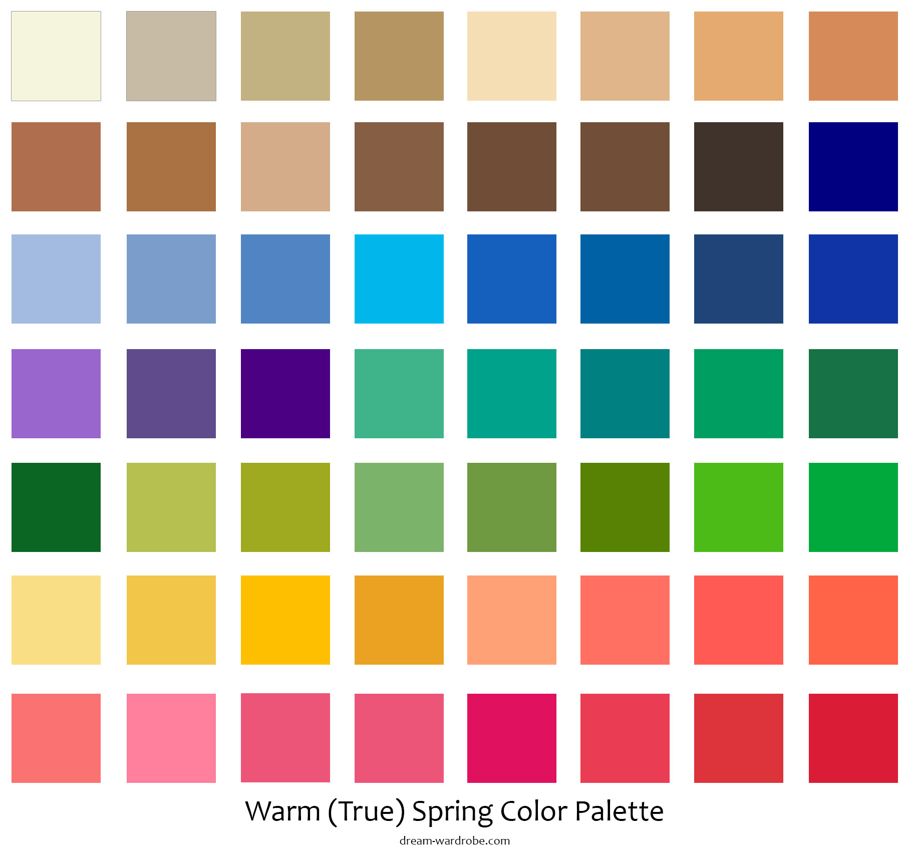
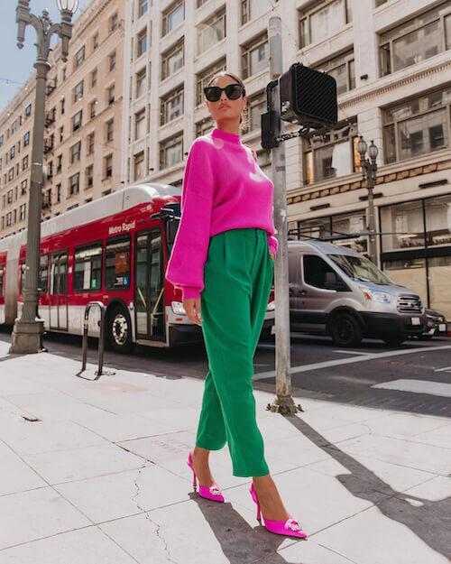
WARM (TRUE) SPRING COLOR PALETTE
In the Warm Spring palette, there is no room for cool colors—every shade exudes warmth. Your colors are as vibrant as mango, papaya, guava, watermelon, cucumber, and peach. Fabulous neutral tones include pecan, caramel, golden khaki, peanut butter, and camel. As the True Spring color type, Warm Spring’s palette features warm greens, yellows, orange reds, peachy pinks, and a range of light browns from beige to brown. Although Spring typically suggests lighter colors, Warm Spring’s hues are deeper and more saturated than one might initially expect.
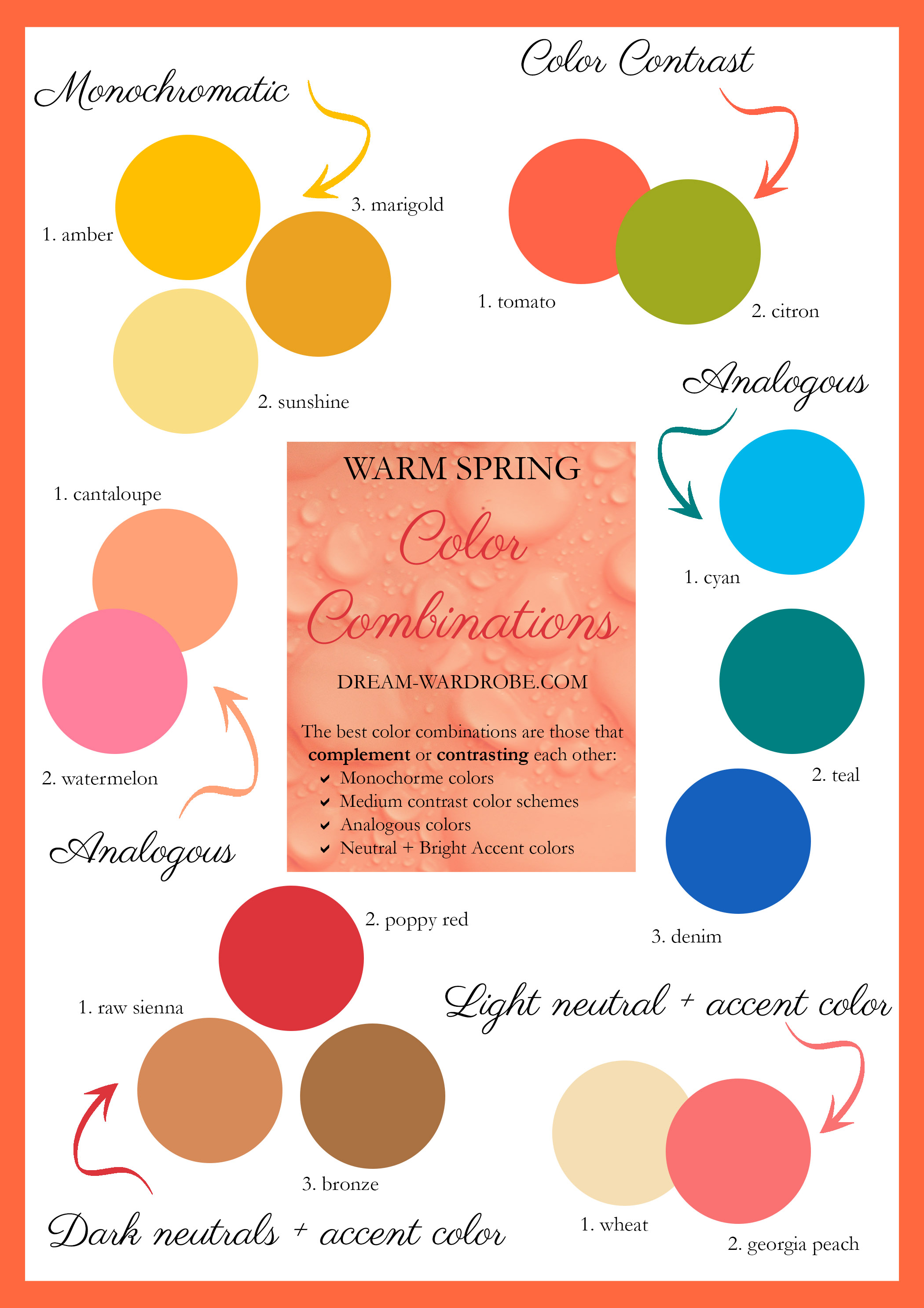
WARM (TRUE) SPRING COLOR COMBINATIONS
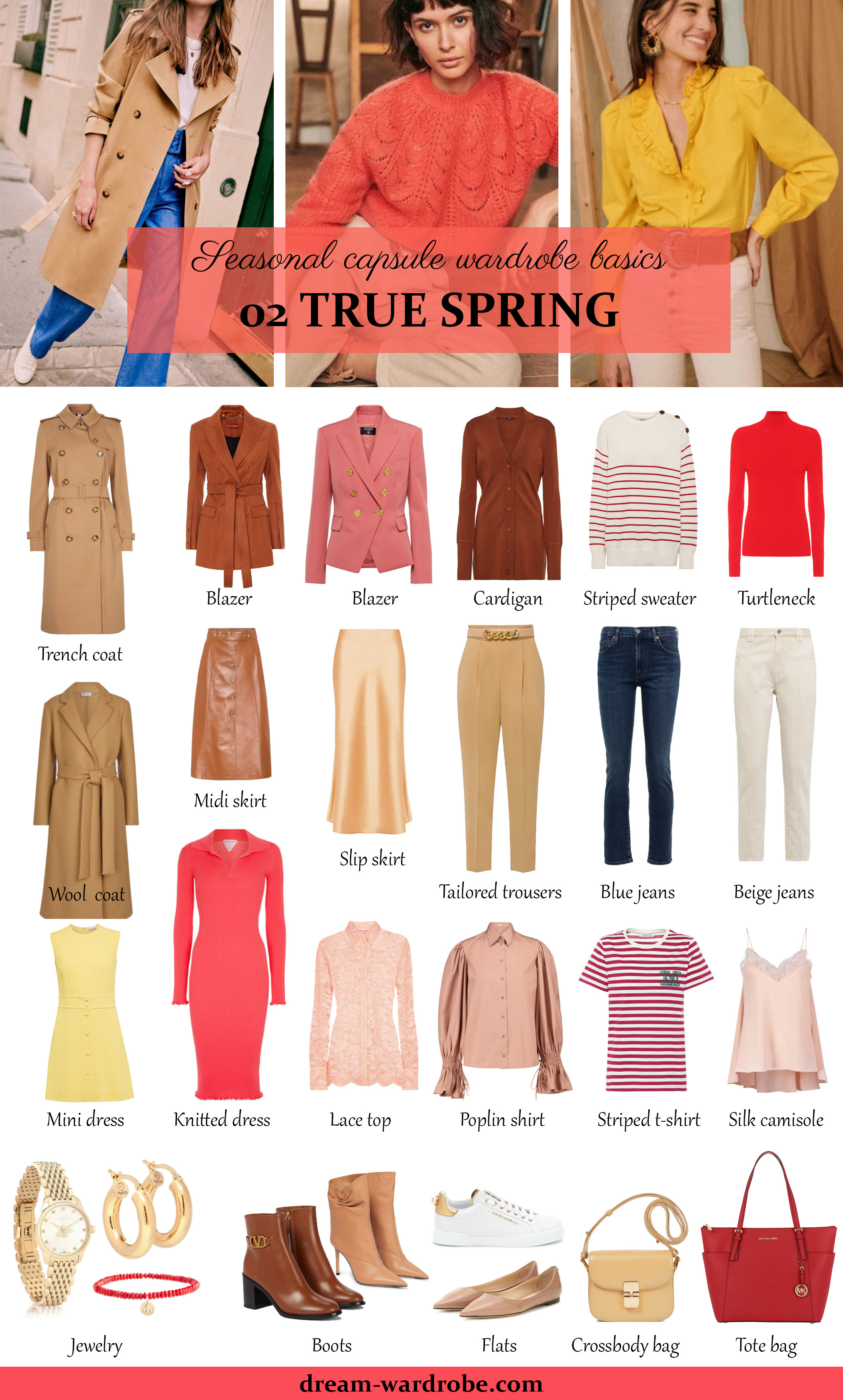
WARM (TRUE) SPRING CAPSULE WARDROBE BASICS
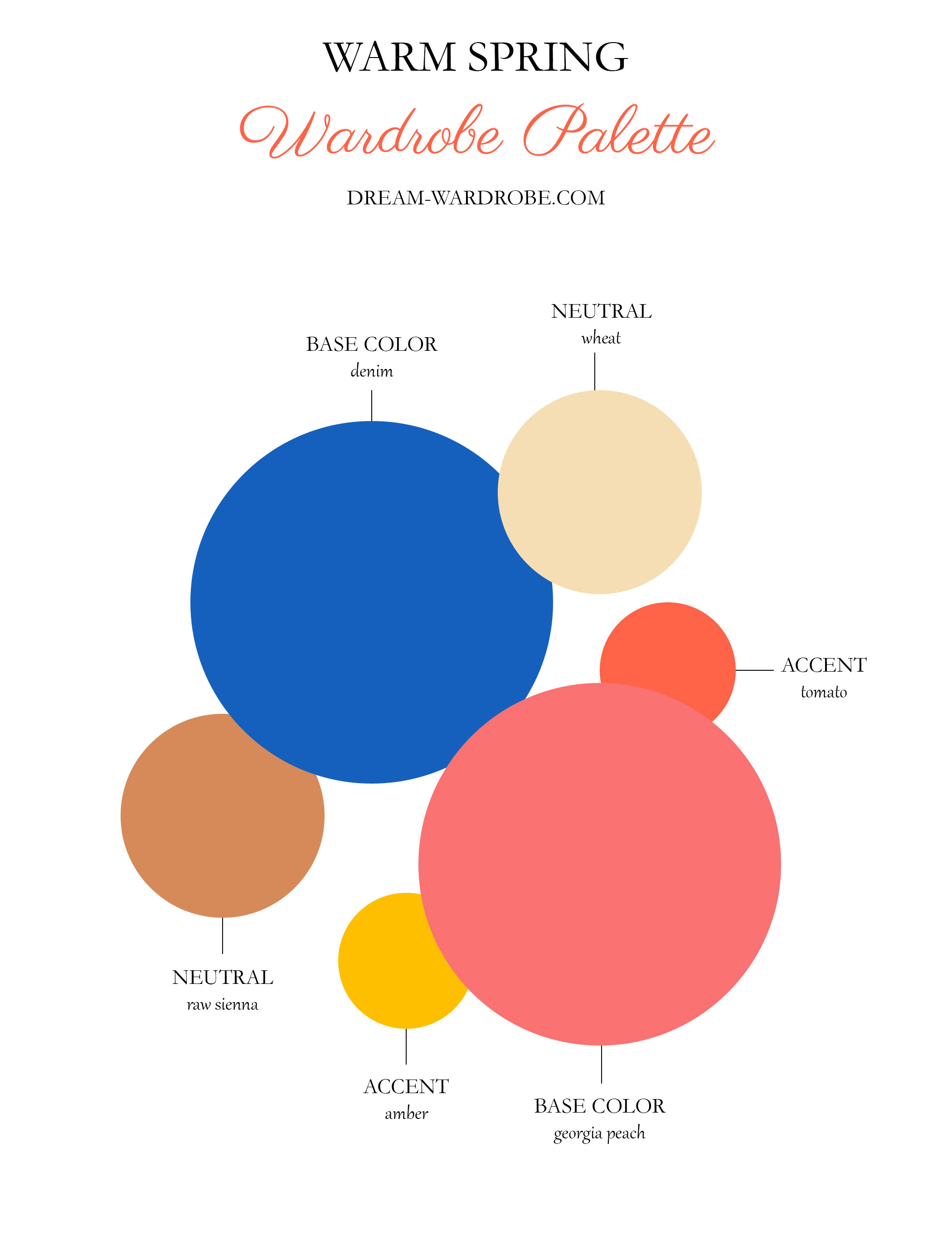
WARM (TRUE) SPRING WARDROBE PALETTE
WARM (TRUE) SPRING WARDROBE
PARTY WARDROBE
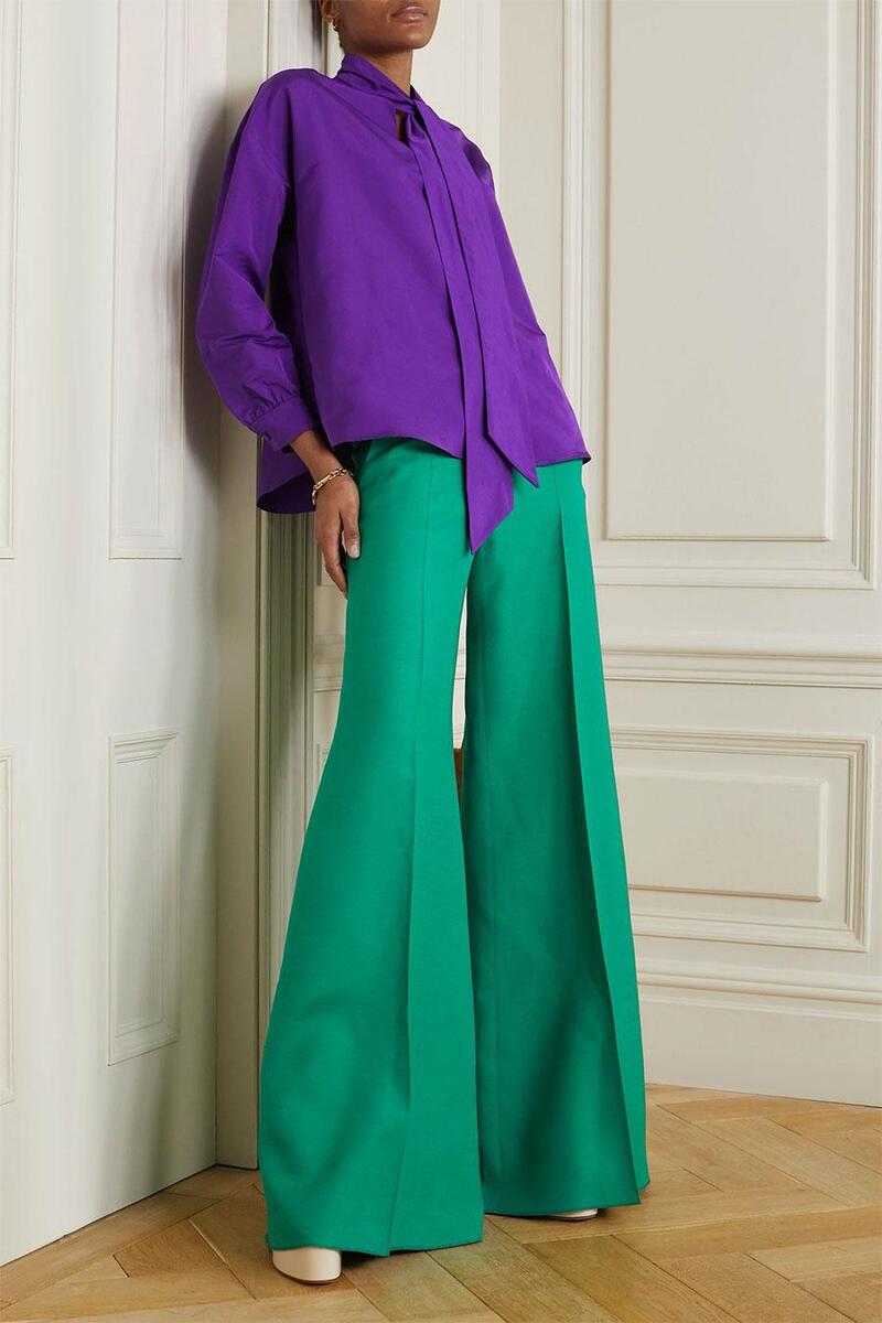
For evening events, metallic gold dresses are a stunning choice, especially if made from luxurious, shiny fabrics. You can also opt for a range of colors including bluish-green, coral, pink, purple, and yellow. Pair your dress with neutral, metallic, or tonal accessories to complete the look.
OFFICE WARDROBE
Create your office wardrobe with neutral colors like beige and brown as a foundation. To keep your look fresh and vibrant, always incorporate a pop of color. This approach ensures that your overall appearance remains both sophisticated and professional.
CASUAL WARDROBE
Your casual wardrobe should reflect your personal style, so recommendations can vary. Blue and brown are versatile choices, but incorporating red or indigo can also work well. Feel free to mix and match these colors to suit your taste.
WARM (TRUE) SPRING CELEBRITIES
WHAT COLOURS GO WITH GREEN CLOTHES
Green is a versatile color that can be dressed up or down, making it a great choice for all sorts of clothing. But with so many shades of green, from lime to olive to emerald, it can be tricky to know what colors will complement it best. Fear not! This guide will explore a range of colors that pair beautifully with green clothes, helping you create stylish and confident outfits. We’ll cover classic neutrals, bold brights, and unexpected yet flattering combinations, so you can unleash your inner fashionista.
10 BEST COLORS TO PAIR WITH GREEN CLOTHES
GREEN AND WHITE
When it comes to timeless color pairings, nothing beats the classic combination of white and any colorful garment. This pairing effortlessly elevates the vibrancy of the chosen hue, turning it into the standout piece of any outfit. Among the spectrum of greens, lighter shades like mint particularly shine when paired with white. They create visually appealing ensembles that exude style and sophistication.
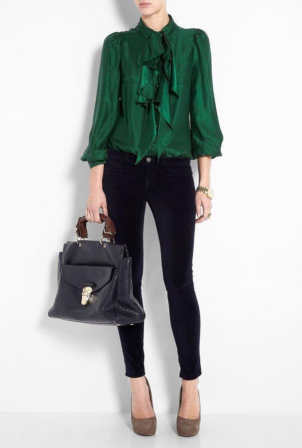
GREEN AND BLACK
The combination of green and black exudes a sense of formality and elegance. When seeking the perfect complementary color for your green ensemble, black is always a reliable choice. This pairing is particularly effective as black acts as a stabilizing force, bringing cohesion and sophistication to the overall look. For instance, layering a green coat over a black outfit creates a striking yet polished ensemble, allowing the green to command attention. Incorporating black accessories such as a necklace, bag, and shoes further enhances the harmony of the outfit. Not only do these accessories highlight the green attire, but the versatility of black also enables it to seamlessly blend with other colors, adding depth and dimension to the ensemble.
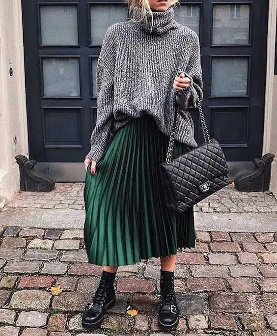
GREEN AND GRAY
Gray is a fail-safe choice when it comes to pairing with green. Regardless of the shade of green you’re wearing, gray effortlessly complements it. As a neutral tone, gray seamlessly matches with green ensembles, making it a versatile option for any occasion. This color combination is particularly well-suited for classy and formal events, as gray has a knack for balancing out and harmonizing with other colors. Its neutral nature helps blend green outfits together cohesively, resulting in a polished and sophisticated look.
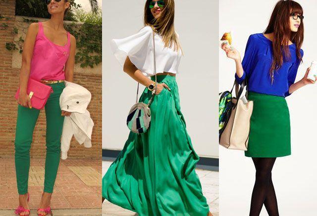
GREEN AND PINK/BRIGHT PINK
Pink remains a timeless classic and when combined with green, it creates a visually striking combination. Rent a combination of the items you brought to the pink concert with a little green. Not only does it add a sweet feminine touch to your green outfit, but pink also serves as a great complementary color. However, when combining vibrant shades of pink with green, it is important to consider the intensity of both colors. For example, if you choose a vivid Barbie pink, you should avoid pairing it with an equally striking neon green. Allowing one color to take precedence ensures a harmonious balance between the two. Striving for a careful balance between vibrancy and understated elegance will enhance the overall aesthetic appeal.
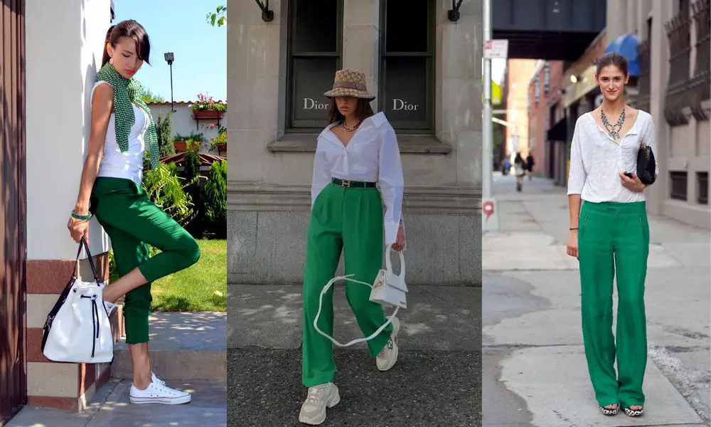
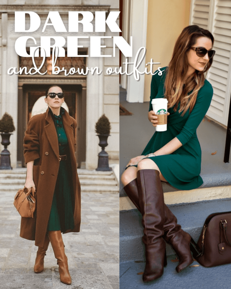
GREEN AND LIGHT OR NUDE TONES OF BROWN
Green and brown tones harmonize effortlessly, creating a natural and complementary pairing. When working with cooler shades of green, opting for lighter and softer brown tones is ideal. If you’re looking to style a pair of khaki pants or similar-toned trousers, they pair beautifully with tops in shades like pistachio or sage green. A perfect example of this casual yet chic combination can be seen in Ira Denise Oyco’s effortlessly stylish and errands-ready outfit.
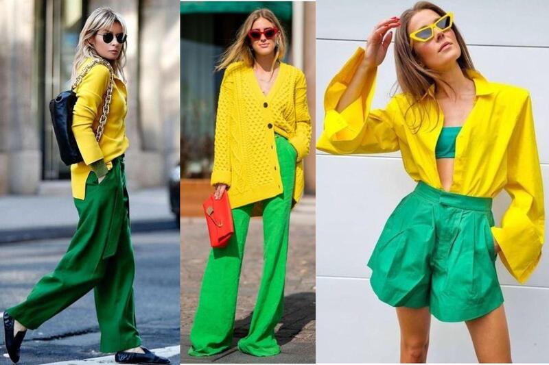
GREEN AND YELLOW
Green and yellow is a combination that’s having a major moment! Sometimes referred to as the “Sprite” palette after the popular lemon-lime soda, this duo brings a refreshing and playful vibe to any outfit. You can create a bold look with a lime green dress and sunny yellow heels, or go for something more subtle with an olive green jacket and a mustard yellow scarf. This color combo is perfect for spring and summer, and it’s guaranteed to turn heads!
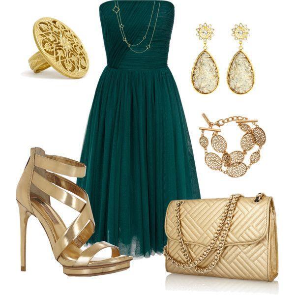
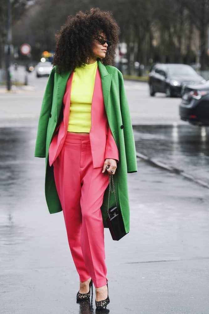
GREEN AND GOLD OR SILVER
Similar to jewel tones, metallic colors offer a vibrant contrast to your green attire. As neutrals, they seamlessly complement any shade of green. Enhance your all-green ensemble by incorporating a gold or silver chain belt, or consider clothing with bronze or chrome accents. For a timeless look, pair deeper olive greens with gold accessories, while silver complements emerald green and sea green hues exquisitely, adding sophistication and class. Experiment with a green dress paired with metallic sandals for a chic and stylish ensemble.
GREEN AND PURPLE
Purple serves as the visual complement to neutral green, resulting in a harmonious and aesthetically pleasing color combination. When paired with a kelly or emerald green garment, purple pieces exude a sense of warmth, creating an eye-catching ensemble sure to capture attention. Follow Laureen’s lead and experiment with this color duo for a playful yet stylish look, perfect for rocking a casual, school girl-inspired outfit!
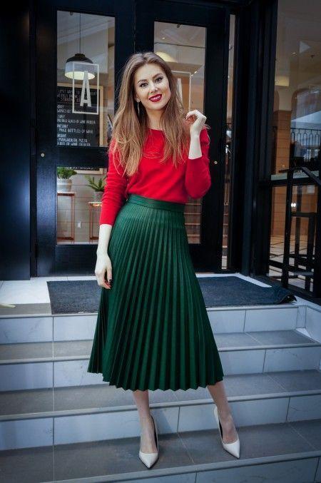
GREEN AND RED
Green and red clothing presents a dynamic and eye-catching style choice. This classic color combination not only exudes a festive vibe reminiscent of holidays but also offers versatility for various occasions. Whether it’s a bold emerald green dress paired with striking red accessories for a glamorous evening look or a casual ensemble featuring a red sweater layered over olive green pants for a cozy yet chic vibe, green and red clothing combinations are sure to make a statement. The contrasting hues of green and red create visual interest, making these outfits stand out from the crowd with their vibrant and energetic appeal.
GREEN AND CORAL COLOR
Coral, with its shades of pink, peach, and orange, emanates a feminine, fresh, and cheerful aura that commands attention. When matched with softer and understated hues of green such as teal green, seafoam green, mint green, and even army green, coral’s relaxed vibe becomes the focal point. This pairing allows the green tones to assume a subtler and complementary role, enhancing the overall harmony of the ensemble.
CAN ANYONE WEAR GREEN?
Wearing green is accessible to everyone—it’s all about discovering the ideal shade to overcome any perceived challenges with this earthy hue. Green, being nature’s color, exudes a calming, organic, and laid-back aura. With the exception of fluorescent and neon shades, it effortlessly complements most colors on the spectrum. Moreover, it suits individuals with various skin tones, whether cool or warm. Yet, pinpointing the precise shade of green can prove challenging due to the extensive range of variations available.
HOW TO FIND THE BEST GREEN COLOR
Finding the most flattering shade of green for you involves considering two main factors: your skin tone and your overall coloring (including hair and eyes). Here’s how to navigate the world of green and discover your perfect match:
IDENTIFY YOUR SKIN UNDERTONE
Understanding your skin’s undertone, whether cool (pinkish or blueish) or warm (yellowish or peachy), is key. Cool-toned skin pairs well with cool greens like emerald, mint, or jade. Warm-toned skin shines with olive, goldenrod, or lime greens.
CONSIDER YOUR OVERALL COLORING
Think about your hair color and eye color. If you have dark hair and eyes with cool undertones, you can rock a wider range of greens, including bold emeralds. For lighter features with cool undertones, softer greens like sage or seafoam might be more flattering. Warmer features with lighter hair and eyes might find luck with muted olive greens, while those with deeper coloring can pull off rich, golden greens.
Remember, there are no hard and fast rules! Experiment with different shades of green and see what makes you feel most confident and beautiful.
CONCLUSION
So, you’ve explored a vibrant range of colors that complement green clothing, from classic neutrals to playful brights and even metallic accents. With this knowledge in hand, you can confidently create stylish and eye-catching outfits. Remember, the key is to consider the shade of green you’re working with, your own personal style, and the occasion. Don’t be afraid to experiment and have fun! Green is a versatile color with endless possibilities, so embrace its energy and create looks that are uniquely you.