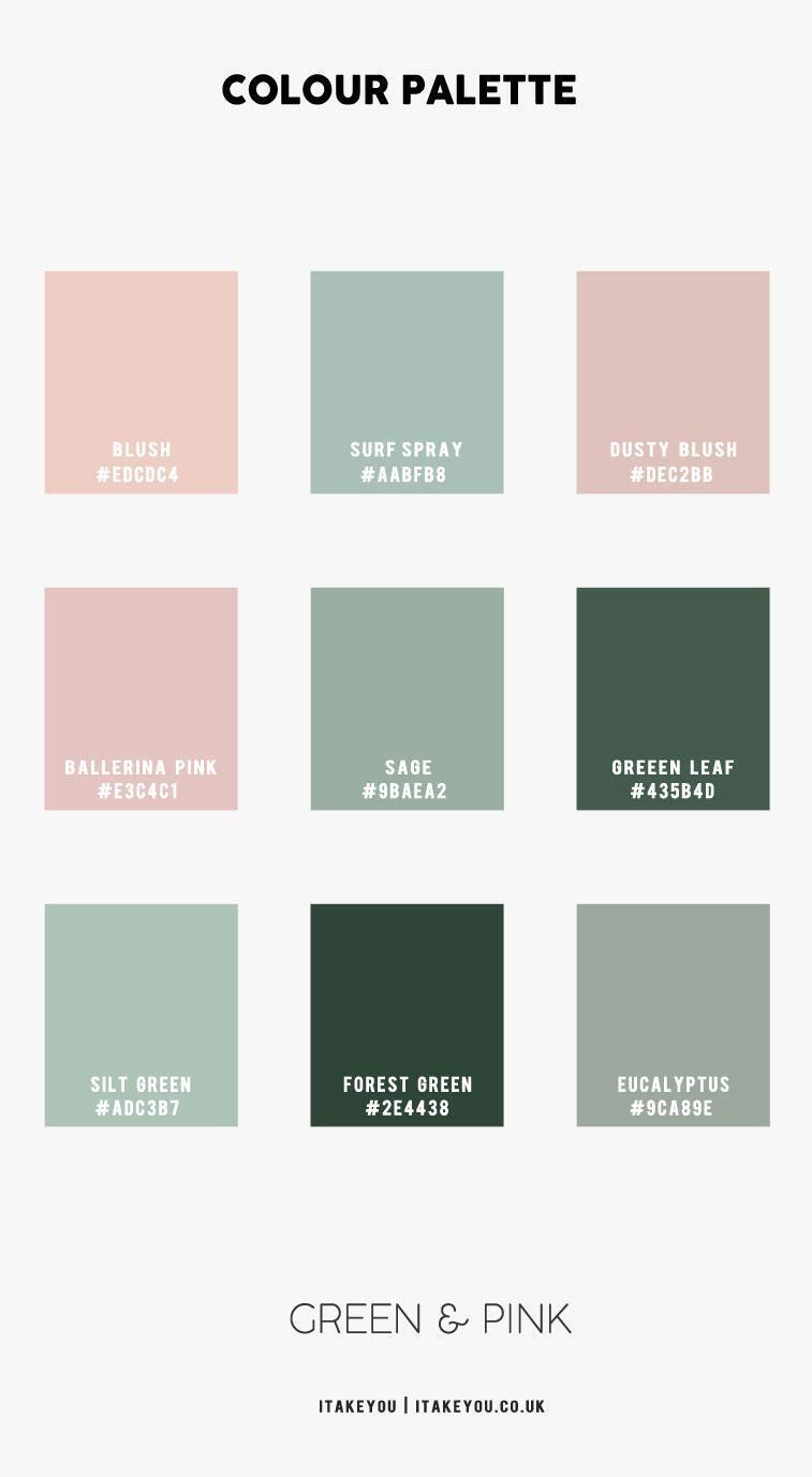
A GREEN AND PINK BEDROOM COLOR COMBO

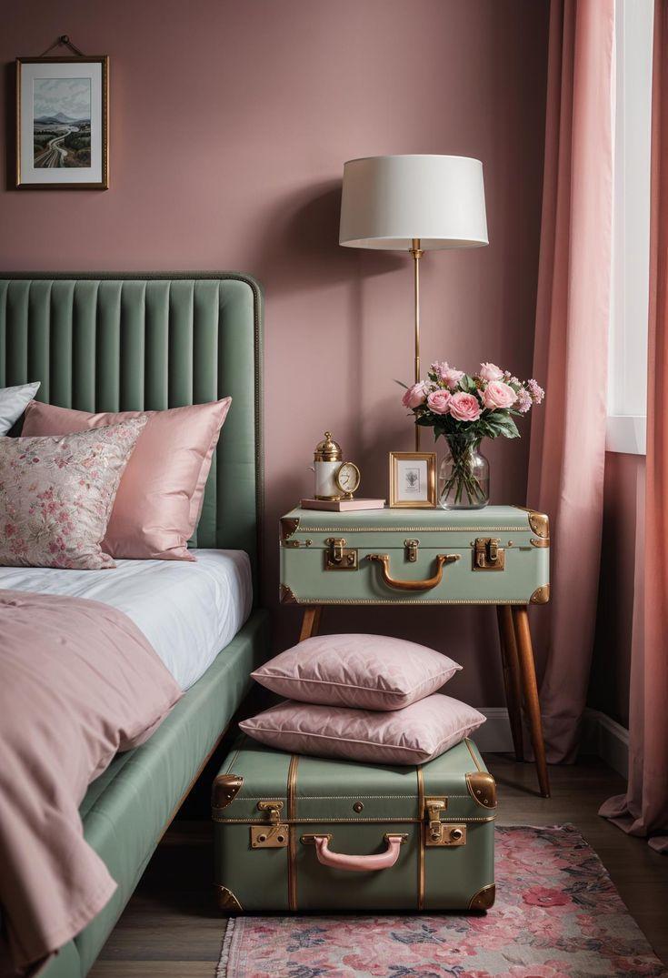
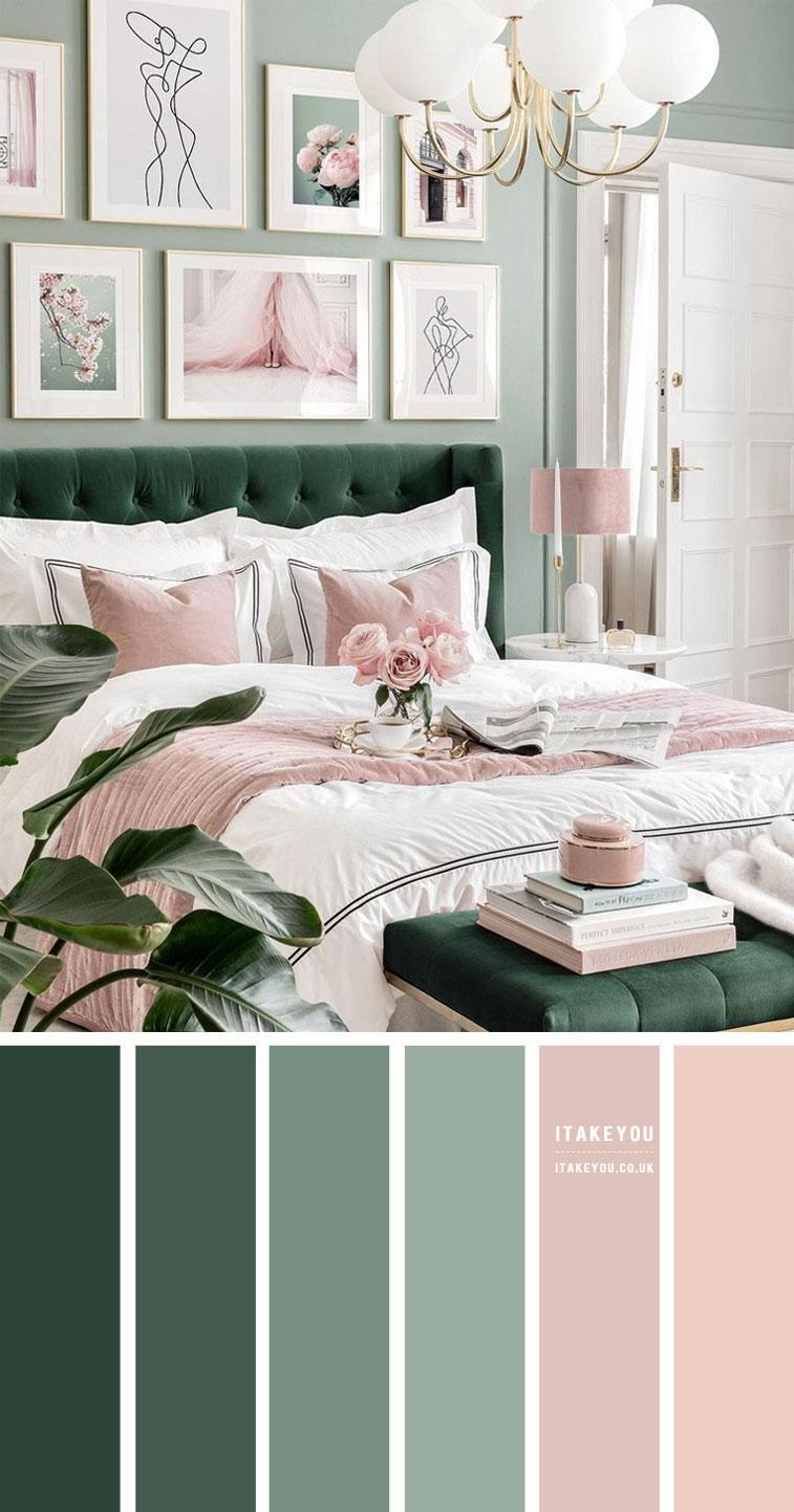
When designing a bedroom color scheme, it’s essential to consider your personal style and the atmosphere you want to create. For a calming yet warm vibe, a green and pink combination is a great choice. Green brings a sense of tranquility, while pink adds a soft, feminine warmth.

This trendy pairing of green and pink creates a refreshing and peaceful atmosphere. The contrast between light and dark green tones, complemented by subtle pink accents, adds depth and visual interest to the room, making it feel both soothing and inviting.

How to use green and pink in bedroom

  • To incorporate a green and pink color scheme into your bedroom, start by painting the walls in a soft green shade to create a fresh, inviting atmosphere. This light hue will set a calming tone for the room.
  • Next, introduce a dark green headboard as the centerpiece of the bed. Its rich color will anchor the space, adding sophistication and depth to the design.
  • For pops of pink, create a fun and dynamic focal point with a gallery wall above the bed. A mix of pink and green art prints will tie the colors together and bring a playful touch to the room.
  • When it comes to bedding, opt for light pink or white sheets paired with a green or pink duvet cover, depending on your preference. Adding green or pink throw pillows will complete the look and enhance the cozy vibe.
  • To finish off the design, incorporate complementary accessories like a pink lampshade and white or pink taper candles to add a touch of glamour. Add some greenery or potted plants to bring in a natural, relaxing element. A white or light pink rug will perfectly complement the color scheme and add warmth and texture to the space.

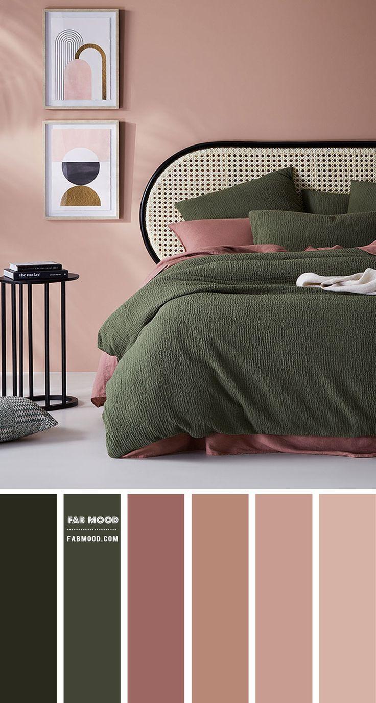
The green and pink color scheme is an ideal choice for a bedroom, offering a serene and calming environment perfect for relaxation and rest. To achieve a harmonious look, it’s important to balance the colors thoughtfully. Choose shades that complement each other, ensuring that the green provides a sense of tranquility while the pink adds warmth and a soft, feminine touch.

Sage Green and Pink Color Combination

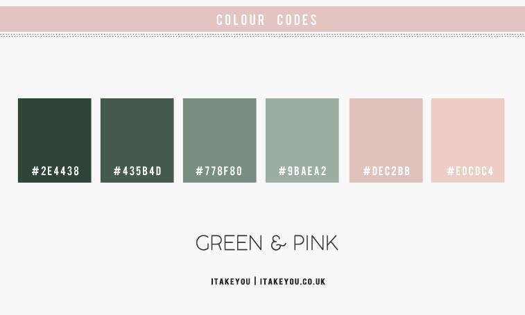
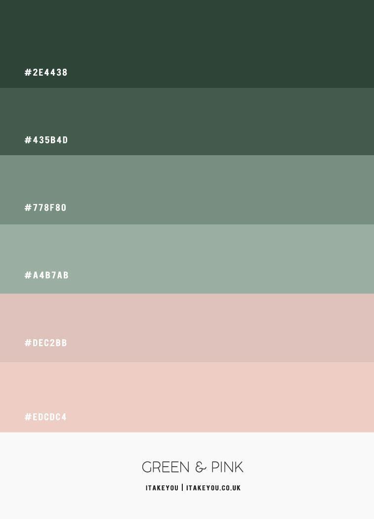
Sage green and pink create a beautiful, harmonious combination that brings a fresh, tranquil, and feminine vibe to any room. The cool, muted tones of sage green are perfectly complemented by the warm, cheerful hues of pink, resulting in a soothing and inviting atmosphere.

Start with a Neutral Base: To balance the boldness of sage green and pink, begin with a neutral backdrop for the walls and flooring. Light beige, soft grey, or off-white walls will provide a calm foundation, allowing the green and pink accents to stand out without overwhelming the space.

Use Sage Green as the Dominant Color: Sage green, being a muted and calming color, can take the lead in the room’s design. Consider applying it to the walls or incorporating it into larger furniture pieces, such as an accent chair, ottoman, or bed linens, to create a peaceful, grounding effect.

Follow the 60-30-10 Rule: For a balanced color scheme, follow the 60-30-10 rule: 60% of the room should feature the dominant color (sage green), 30% should showcase the secondary color (pink), and the remaining 10% should be an accent color. The accent color could be a darker shade of green or pink, or even a metallic finish to add depth and interest.

Add Pops of Pink: Introduce pink as an accent color to bring warmth and vibrancy to the space. Pink throw pillows, curtains, artwork, or a pink vase can create playful yet elegant touches that enhance the room’s overall charm.

Incorporate Natural Textures: To enhance the tranquil, relaxing vibe, integrate natural textures like a jute rug, woven throw blankets, or wooden furniture. These elements will add a cozy, earthy feel to the room, complementing the soft tones of sage green and pink.

Choose Complementary Metals: To finish the look, opt for complementary metals such as brushed gold or silver. These accents will add a touch of glamour and sophistication, elevating the room’s overall aesthetic without detracting from the serene color scheme.

Fresh, Calming + Inviting

Sage green and pink is a versatile and sophisticated colour combination that can work well in a variety of spaces, from bedrooms to living rooms. It’s important to balance out the boldness of the colours with neutrals and natural textures to create a harmonious and relaxing atmosphere. With the right balance, sage green and pink can make any space feel fresh, calming, and inviting.

CONCLUSION

In conclusion, the green and pink color combination offers a harmonious and visually appealing aesthetic for a bedroom. This pairing creates a space that is both calming and invigorating, promoting relaxation and creativity. By carefully considering the specific shades and incorporating complementary elements, you can design a personalized sanctuary that reflects your unique style and preferences.

HOME OFFICE PAINT COLORS: DYNAMIC AND PEACEFUL TONES

Choosing the right paint color for your home office can significantly impact your productivity and overall mood. The right color scheme can create a dynamic and inspiring workspace, while also promoting a sense of peace and tranquility. In this article, we’ll explore the best paint colors to consider for your home office, focusing on dynamic and peaceful tones that can enhance your work environment.

HOW TO CHOOSE THE BEST HOME OFFICE PAINT COLORS

Selecting a color for your home office is a deeply personal decision. While it’s tempting to choose the “most productive paint color ever,” it’s important to also consider how it will integrate with the rest of your home. As we design our home office, which will double as a den, we aim for a space that’s both functional and inviting. We’ve decided to use blue and white as our primary color palette. This choice not only complements the rest of our home but also enhances focus and productivity.

Below, I’ve compiled a list of the best bluish-gray paints from leading paint brands. I’ve included my personal thoughts and recommendations, suggested complementary colors, and noted each color’s Light Reflectance Value (LRV).

HOW COLOR AFFECTS YOUR MOOD

Color psychology has been studied extensively, and fortunately, it’s one of the easiest aspects to change in a room! By simply painting the walls—or even just one wall—you can transform the entire atmosphere of your space. Here’s a breakdown of some popular color choices for home offices and how they can affect your work environment:

Green:  Green is known for its calming and balancing effects and can also be energizing. Traditionally associated with ambition and financial success, green can be a great choice for an office. Whether you prefer greenish-gray tones, bluish-greens, or earthy greens, there’s a wide range of green shades that can enhance your workspace.

White:  White offers a clean slate that’s perfect for creatives who need a distraction-free environment. It’s also invigorating. While it might not be suitable for a sterile corporate office, white works wonderfully in a home setting with cozy, plush furniture. Warm whites, in particular, add a touch of warmth (find the best warm white paint colors here).

Light Gray:  Light gray is a versatile neutral that promotes productivity and focus. It strikes a balance between the starkness of white and the depth of darker colors, making it a great choice if you’re looking for a restorative and adaptable hue.

Dark Gray/Charcoal:  Dark gray, or charcoal, can create a focused and introspective environment. It’s ideal for those who need to concentrate deeply on their tasks.

Pink:  Warm pink shades, such as coral and peach, can boost energy and focus. Pink is also linked to increased creativity, making it an excellent choice for a feminine workspace or any job that requires creative thinking.

Blue:  Blue is renowned for its soothing and relaxing properties. It helps maintain calm and productivity, making it an ideal color for a workspace.

Each of these colors can significantly impact your work environment, so choose one that aligns with your personal preferences and needs.

BEST GREEN PAINT COLORS FOR HOME WORKSPACES

Green, often associated with money, makes a fitting choice for a space designed to foster productivity and financial success, such as a home office. However, I’m not suggesting you go for a bold kelly green. Instead, consider the color options below, which feature softer greens blended with gray to create a calming and balanced atmosphere. Green is also linked to power, ambition, and equilibrium—qualities that can enhance your home workspace.

Now, let’s dive into selecting the perfect green paint color.

The most sophisticated green paint colors feature nuanced undertones. While a vibrant kelly green has its appeal, it’s best reserved for accents rather than an entire room. My top green paint choices below either have a sage-like quality, with a touch of gray and earthy undertones, or incorporate a hint of blue. These subtle variations add depth and elegance to your space.

GREENISH-BLUE PAINT SHADES

This beautiful workspace from House that Lars Built showcases the effectiveness of a soothing blue with a hint of green. Combined with the geometric-patterned painted floor and the sleek lines of the desk and mirror, this office exudes a professional, boss-level vibe!

EARTHY GREEN PAINT TONES

If you’re aiming for an earthier paint color, consider Benjamin Moore’s Soft Fern. This serene sage hue blends beautifully with wood tones and beiges, providing a grounded and calming effect that supports focus and productivity. For a deeper option, you might like Behr’s Pinecone Hill, which offers a richer, more robust tone.

GRAYISH-GREENS

I particularly love paint colors with a strong gray undertone. Below, you’ll find two beautiful examples of home offices featuring greenish-gray hues.

WHITE HOME OFFICES

If you’re a creative or have a penchant for colorful home furnishings and decor, you might desire a crisp, clean workspace that acts as a blank canvas. While productivity experts often advise against painting office walls white due to concerns about sterility and reduced work performance, I believe white can be stunning when paired with cozy and vibrant furnishings.

The main objection to white in traditional office settings is its association with sterile environments. However, in a home office, where comfort is paramount, white can be far from boring. Just take a look at the rooms below—they are anything but sterile!

The secret lies in choosing the right shade of white paint and incorporating colorful rugs, fabrics, and artwork to bring the space to life.

The office space above demonstrates how a wood-toned desk and file cabinet can add warmth to an office. The blue area rug further infuses the room with vibrant color, creating a dynamic and inviting atmosphere.

Kaleidoscope Living (formerly Designer Trapped in a Lawyer’s Body) showcases her home office above. The white walls act as a blank canvas, allowing the bold artwork to take center stage. The result is a beautifully designed home office where creativity shines.

Casa Watkins reveals her basement home office in the picture above. Although the walls are white, the space is full of character! With a wallpapered ceiling, a bold rug, and vibrant accessories, she has crafted a dynamic and lively workspace.

Eva Amurri Martino’s workspace, featured above, predominantly uses white (likely Benjamin Moore’s Decorator’s White). Despite the mostly white furniture and rugs, the room is anything but sterile. The colorful curtains (the same fabric we used in the girls’ bedroom—available here) add vibrant personality and a pop of color. This lively touch is mirrored in the pink chandelier, wastebasket, and decorative accessories, infusing the space with charm and character.

LIGHT GRAY HOME OFFICE WALLS

If you’re seeking a neutral, airy office with a bit more warmth and depth than white walls, light gray might be your ideal choice. Below, I’ve highlighted a few of my favorite light gray paints, which I’ve used repeatedly in my own home!

A comfortable and stylish desk chair introduces a splash of color and complements the oriental rug, helping to unify the room. Don’t forget to include fresh (or faux) flowers to enhance the space further.

Although more neutral than some other offices, this one remains far from sparse. The combination of beige, light brown, and white creates a functional and stylish space. If you’re short on room, a secretary desk like the one shown above offers both storage and a convenient spot for your laptop.

The Polished Habitat’s feminine home office demonstrates that you can achieve a girly aesthetic without pink walls. By incorporating a pink oriental rug, pink throw pillows, pink artwork, and a playful upholstered pink stool, she proves that color can be introduced in diverse and stylish ways.

Emily Ley’s former home office exudes classic style with its white built-ins, light gray walls, and blue and white accessories.

Emily Ley’s current home office, shown above, maintains a similar aesthetic—proving that sticking with what works can be highly effective! By incorporating a stunning blue oriental rug and a plush office chair, she anchors the space, creating a balanced and harmonious feel.

CHARCOAL AND DARK GRAY OFFICE WALLS

Dark gray or charcoal walls are currently on-trend for offices. Their moody appearance may help you turn inward and concentrate. The offices below demonstrate how dark walls can enhance focus while evoking a sophisticated “gentleman’s study” aesthetic.

Best Charcoal or Dark Gray Paint Colors for Offices:

  • BM Kendall Gray
  • BM Chelsea Gray
  • BM Nightfall
  • SW Tricorn Black
  • BM Iron Mountain
  • Farrow & Ball Downpipe
  • BM Wrought Iron

Driven By Decor illustrates how moody and dramatic offices can boost productivity in her stunning home office, painted in Benjamin Moore’s Nightfall.

PINK HOME WORKSPACE

A pink hue can create an inspiring and playful atmosphere in a home office. Opt for lighter pinks to achieve an “airy” feel, and choose shades with orange undertones to give the color a more sophisticated edge. Farrow & Ball’s Pink Ground and Middleton Pink are excellent choices, offering a subtle touch of orange that enhances mood and creativity.

BEST PINK PAINTS FOR CREATIVITY

  • Farrow & Ball Pink Ground
  • Behr Citrus Delight
  • Benjamin Moore Pink Fairy
  • Farrow & Ball Middleton Pink
  • Behr Noble Blush
  • Sherwin-Williams Angelic

PINK HOME OFFICE IDEAS

  • Built-In Bookshelves: PMQ for Two demonstrates how to style built-ins with a vibrant pink paint, such as Behr Noble Blush, to create a stylish and lively home office.
  • Blush Wallpaper: Lemon Stripes features light coral wallpaper, but a soft pink paint can achieve a similar effect. She balances the space with a beautiful blue oriental rug and gold accents in the desk and bookcase.
  • Sophisticated Pink Walls: Our Fifth House’s elegant pink office combines gold, white, and black and white elements. The black and white geometric rug, stunning burl wood desk, and dark office chair ground the vibrant pink, creating a dynamic and sophisticated look.
  • Light Pink Walls: Rain on a Tin Roof uses Behr’s Citrus Delight to show how light pink walls complement blue and animal prints, resulting in a vibrant and creative home office.

BLUE PAINT COLORS FOR HOME OFFICES

Blue paint colors are known for their calming effects, making them ideal for creating a relaxing workspace where you can focus on your tasks. Light blues offer a soothing atmosphere that promotes concentration, while dark blues provide an energizing boost and enhance focus. Explore some of the top blue paint options below!

BEST BLUE PAINTS FOR CONCENTRATION

  • Benjamin Moore Hale Navy
  • Farrow & Ball Parma Gray 
  • Farrow & Ball Oval Room
  • BM Wythe Blue
  • SW Sea Salt
  • BM Palladian Blue

Charlotte’s House showcases her vibrant blue and white home office, bursting with energy and perfect for sparking creativity. Just look at her space—she is undeniably one of the most imaginative people I know!


Remember: When choosing a blue paint color for your home office, consider the overall lighting and design of the space. A darker blue may be more suitable for a room with ample natural light, while a lighter blue may be better suited for a room with limited natural light.

Life on Virginia Street demonstrates how charming and invigorating a navy blue accent wall can be in a home office featuring dual workstations.

Brooke Crew Interiors presents a serene home office in their Greenwich, CT project, creating an ideal space for focused work.

CONCLUSION

In conclusion, the best color for your home office depends on the atmosphere you wish to create. Each of the colors listed above can enhance productivity and focus in your workspace. Personally, I prefer our home office to be a peaceful extension of our home—one that offers tranquility away from the hustle and bustle of daily life with my four small children . That’s why we opted for a blue and white color scheme, complemented by neutral tones, to create a soothing environment and promote concentration.