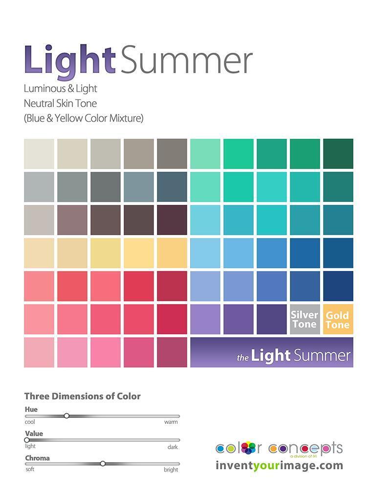
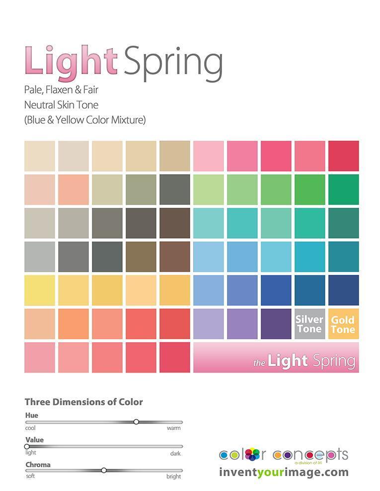
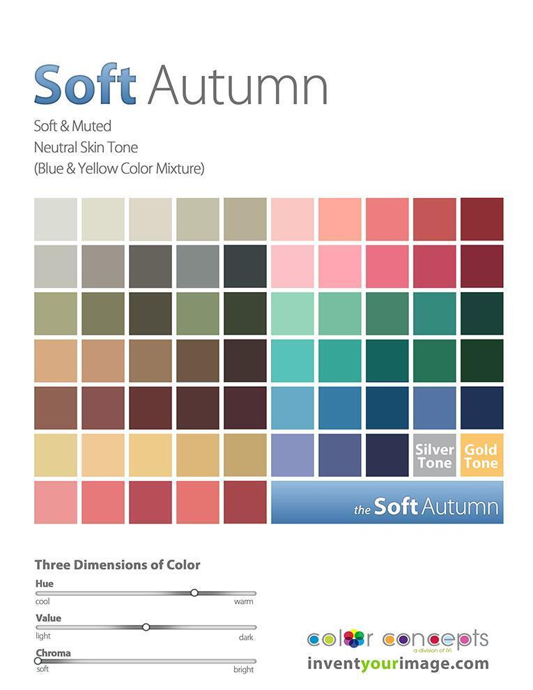
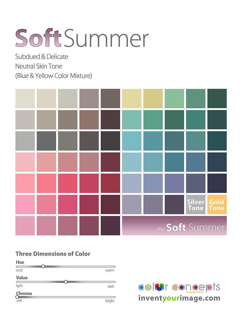
IF YOU ARE GOING TO CHEAT ON YOUR COLOR SPACE

Nature’s colors flow organically—they are not confined to a strict, linear progression, much like the color wheel itself. In the world of color analysis, we use these hues to elevate our clients’ moods, broaden their expressions, and refresh their spirits. Once your color analyst identifies your personal color space from one of the 12 categories, you’ll receive a book of colors tailored just for you, guiding your wardrobe and choices. You begin to live and breathe these colors.

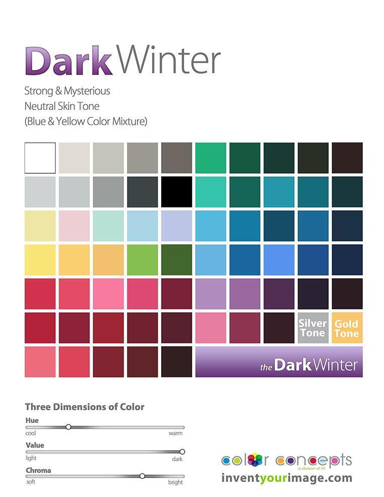
But what if you venture beyond the lines? What if you dare to step outside your designated color space? I often do! Once you understand the three dimensions of color and how they interact with the 12 core tones, you’ll realize that each tone has a natural counterpart, sharing defining characteristics that remain fairly consistent.

So, if you’re ready to push your color boundaries, here are your cliff notes for exploring new possibilities:

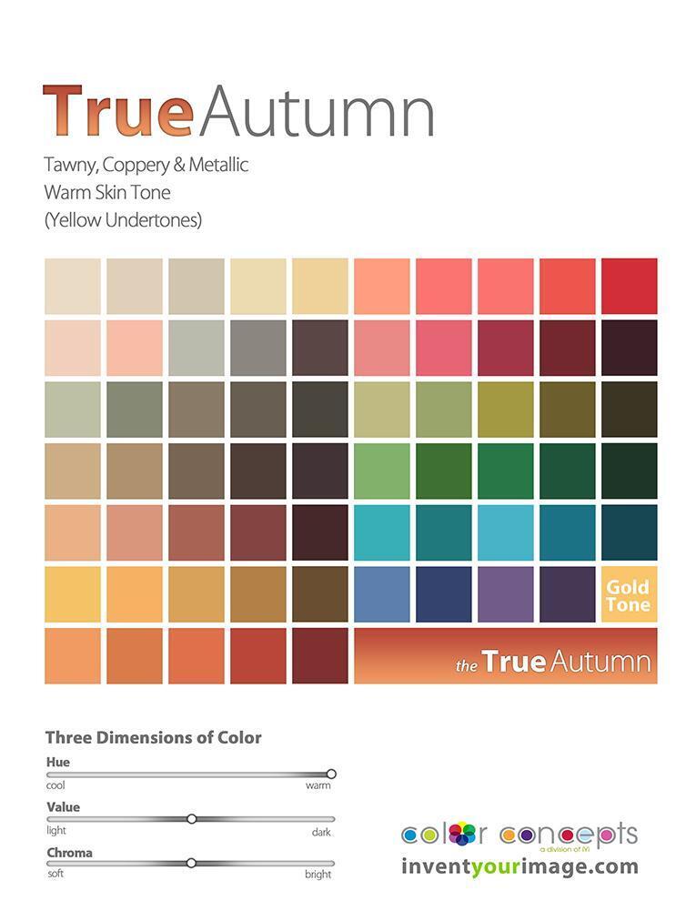
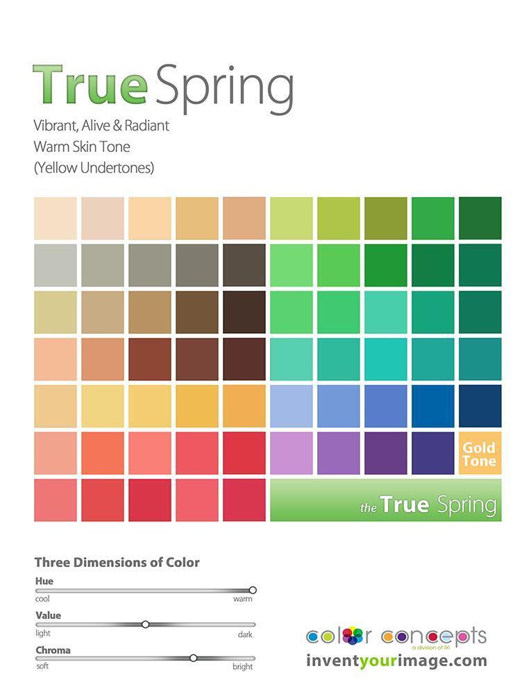
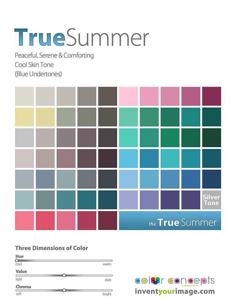
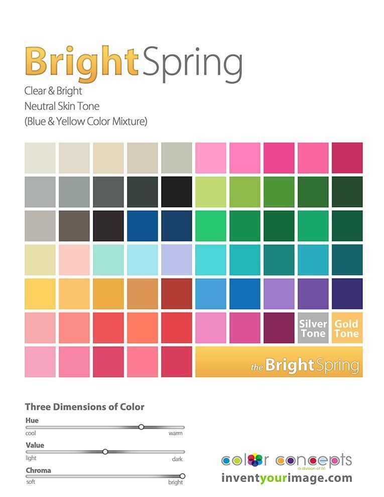
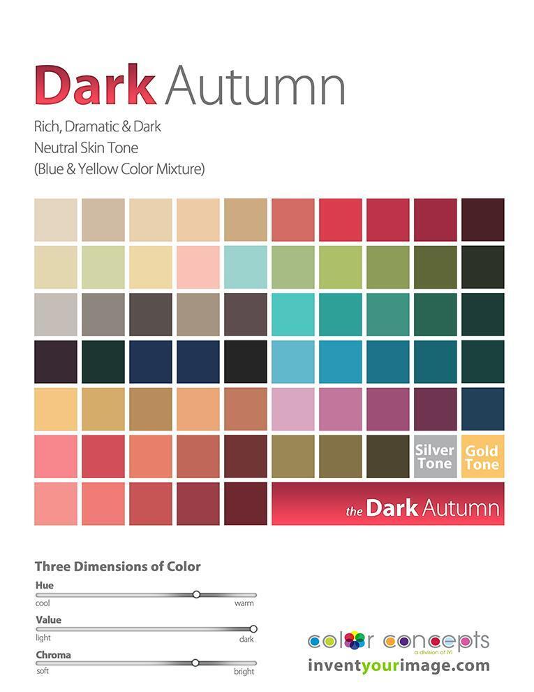
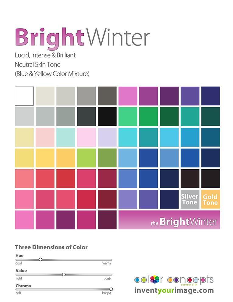
It’s easy to see, when looking at the pictures and the continuum of color dimensions, that their common thread is warmth. Whether it’s a vibrant red, a golden yellow, or a rich orange, these colors share an inherent warmth that connects them across different spaces. This warmth can evoke feelings of energy, comfort, and enthusiasm, making them a natural choice when you want to add vibrancy or emotion to your wardrobe or environment.

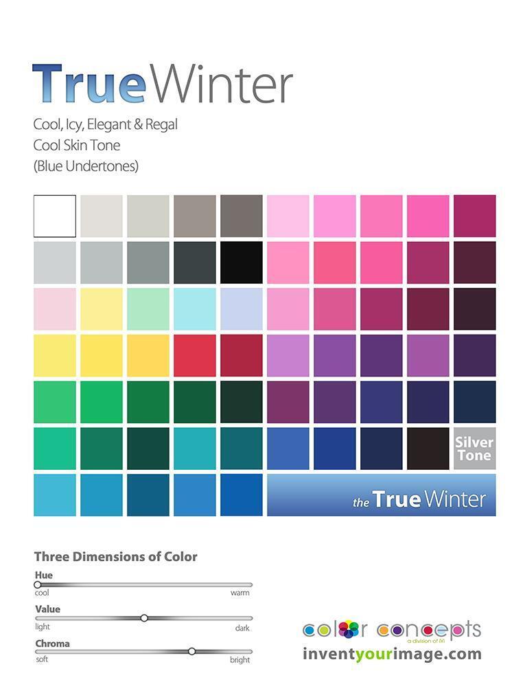
In these two color spaces, we see a shared characteristic in their cool hues. These cool tones, like blues, greens, and purples, have a calming, serene effect, bringing a sense of tranquility and depth.

Now, when we move to the neutral color spaces, things become a bit trickier. The counterparts in these spaces don’t always share the same vibrant or easily definable traits as the cool or warm tones. Neutral tones, such as grays, browns, and soft beiges, are more subtle, often blending and adapting to their surroundings. Translating their similarities across different spaces can be more nuanced, but once you understand the underlying balance of warm and cool undertones within the neutral spectrum, you’ll see how they relate to each other in terms of tone and depth.

So, let’s dive into the neutral spaces and explore how these counterparts align:

Both of these color palettes shift towards the warm side of their neighboring true seasons, as seen in the color continuums (referencing the pictures). They also highlight the brightest and darkest tones within their categories. It’s interesting to note that, without knowing much about color analysis, I find myself naturally drawn to both of these palettes. While I am a Bright Spring (BSp), I am particularly attracted to the Dark Autumn (DA) colors. Even more interesting, my husband and two boys are all Dark Autumns as well. Coincidence? I think not!

Now it’s your turn to think about the commonality they both share. Here’s a hint: consider the three dimensions of color scales. Got it? The key commonality is that the hue is the same. Both palettes lean toward the cool side of their true season, with a focus on the lightest and brightest tones in their group. This creates a fresh, crisp, and vibrant feel that unites them, even if they belong to different seasonal categories. The coolness and brightness are what make them stand out within their respective groups.

In this pairing, both palettes lean towards the warm side of their true season. They also represent the lightest and softest tones within their respective seasons, creating a gentle, harmonious effect. These softer, warmer hues embody a sense of warmth and calm, offering a more delicate and subtle approach to color that still reflects the essence of their season.

In the last pairing, both palettes lean towards the cool side of their true season. They are also the softest and darkest tones within their respective season groups, creating a more muted, refined feel. These colors offer depth and sophistication, while still maintaining the cool essence of their season, providing a rich yet understated look.

CONCLUSION

In conclusion, the exploration of these color pairings reveals the fascinating way that hues, warmth, and coolness interact within each season. By understanding the three dimensions of color—hue, value, and chroma—we can see how each palette has its own unique characteristics that reflect the essence of its true season. Whether leaning toward warmth or coolness, light or dark tones, each color grouping offers a distinct way to express personality, mood, and style. Ultimately, color analysis not only helps us define our personal palettes but also allows us to connect more deeply with the colors that resonate with us naturally. So, whether you stick to your designated season or venture into neighboring ones, there’s no wrong way to embrace the power of color.

SOFT AUTUMN: THE ULTIMATE GUIDE TO YOUR COLOR PALETTE AND CAPSULE WARDROBE

Soft Autumn combines the warm, inviting undertones of autumn with the soft, understated qualities of summer, making it a distinctive category in the 12-season color analysis system. This seasonal blend is perfect for those who have an overall gentle warmth in their features, where no single element stands out prominently. If you find yourself drawn to soothing, neutral tones like beige and olive, and feel a sense of calm at the sight of a misty forest morning, Soft Autumn may be your ideal match.

This guide will explore the Soft Autumn profile in detail, including physical characteristics, makeup recommendations, and a tailored color palette. You’ll also discover essential wardrobe staples for Soft Autumns and learn how to create a custom palette that enhances your natural beauty. Keep reading to uncover how to fully embrace and elevate your Soft Autumn style.

THE 12 SEASONS OF COLOR ANALYSIS

Seasonal color analysis is a transformative tool that reveals which colors enhance your natural beauty and boost your confidence. By assessing the undertones of your skin, eyes, and hair, this system places you into one of 12 unique color categories, each offering a tailored palette that highlights your best features.

This approach is based on six key color elements: warm, cool, deep, light, soft, and bright. Within the warm spectrum, the Autumn color family is distinguished by its medium to dark, muted hues.

The Autumn palette includes:

  • Soft Autumn (your focus today)
  • Warm Autumn
  • Deep Autumn

In this guide, we’ll explore the Soft Autumn palette—a harmonious blend of warm undertones and subtle contrasts that creates a soothing, refined look.

SOFT AUTUMN IS WARM AND SOFT

Soft Summer is characterized by the following attributes: warm hue, medium value, and muted chroma.

Warm Hue: Soft Summer has a warm undertone, typically red, though it can sometimes appear cooler due to various pink or white overtones. This can make it challenging to differentiate between Soft Autumn and Soft Summer.

Medium Value: Soft Summer features medium-value colors. While Soft Autumn generally leans towards medium to dark values, Soft Summer colors may range from medium pinks and reds to deeper greens and blues, depending on the specific family.

Muted Chroma: The most defining trait of Soft Summer is its muted chroma. Unlike bright colors, Soft Summer colors are subdued and lack intense vibrancy. Bright hues are not suitable for this palette and can help distinguish it from Soft Autumn.

While Soft Autumn shares warmth with its seasonal counterparts, its defining characteristic is its muted gray undertone. This gives Soft Autumn a softer, more subtle appearance compared to the more vibrant Autumn types.

Skin: Soft Autumn skin often ranges from gentle beige to taupe. Skin tone may shift from a golden glow in the summer to an ashy warmth in winter due to sun exposure.

Eyes: Eyes in Soft Autumn are usually brown, green, or blue with a soft, opaque quality. Unique patterns, such as olive overlays and brown specks, are common.

Hair: Hair color in Soft Autumn is generally in the brown family, from light to medium or dark shades, and may include gold, red, or faint auburn highlights. Dark blonde and occasionally medium blonde hair are also seen. Hair color complements the overall muted, harmonious look of the Soft Autumn palette. Features are balanced and unassuming, coming to life when paired with the appropriate colors for the season.

MAKEUP FOR THE SOFT AUTUMN WOMAN

To enhance the Soft Autumn look, your makeup should reflect its warm and soft characteristics.

Eyes: Opt for light neutrals such as cream, blush, and copper, or rich tones like brown and olive. For accents, consider soft plum or warm teal to add subtle depth.

Cheeks: Choose neutral warm shades like sand, coral, and peach to create a natural, peachy glow that complements the Soft Autumn palette.

Lips: Nude shades, along with copper and caramel, work beautifully for everyday looks. For a bolder statement, try chestnut, mocha, or coral red.

Avoid cool tones such as pink or berry red lipsticks, cool blue or green eyeshadows, and soft pink blushes. Dark lip colors are also best avoided as they can overpower the Soft Autumn’s gentle aesthetic.

INSPIRATION: THE NATURAL BEAUTY OF SOFT AUTUMN

The Soft Autumn palette is renowned for its serene warmth and subtle elegance, beautifully reflected in the imagery of a fog-draped landscape. This season’s colors blend the warmth of browns, reds, oranges, yellows, and greens with a gentle hint of gray, creating a harmonious and muted visual experience.

Nature provides rich inspiration for Soft Autumn. Consider the soft transition of a leaf changing colors, where summer’s vibrant hues gradually give way to autumn’s deeper tones. Similarly, the tranquil beauty of a spring scene illuminated by a setting sun offers a glimpse of the warm teal blues that define this palette. These colors capture the essence of Soft Autumn, balancing warmth with softness.

VISUAL INSPIRATIONS:

Leaf Transition: Observe a leaf in mid-transition, where summer’s brightness subtly merges with autumn’s rich, muted colors, embodying the essence of Soft Autumn.

Marigold Glow: The soft, muted glow of marigold leaves under gentle lighting highlights Soft Autumn’s range, connecting deeply with the natural cycle of change.

Sunset Brilliance: The warm yellow hues of a cloudy sunset, blending seamlessly with ivory and taupe, illustrate Soft Autumn’s palette as it transitions from day to night, capturing the season’s tranquil beauty and warmth.

These natural scenes offer a visual guide to embracing the Soft Autumn palette, encouraging you to explore and incorporate these muted, warm colors into your wardrobe and personal style.

SOFT AUTUMN COLOR PALETTE

When creating a Soft Autumn palette, begin with neutral tones and then explore the major color families.

For Soft Autumn, black and white are too harsh, so replace black with brown and denim, and white with ivory. Essential neutral colors for this palette include olive, blush, and camel.

Soft Autumns benefit from rich, muted hues. Burgundy and squash are ideal soft tones. Given the blend with summer, there’s a wider range of pinks available, though warm pinks like blush are particularly suitable. Yellows in this palette can include soft brass, flax, and marzipan. Greens should be medium to light, while blues can be cool but should have a green undertone to fit the autumnal theme. Warm purples, especially those with red undertones, complete the palette.

While most colors can be adapted to fit any season, some may be challenging to match for Soft Autumn. Warm pinks often translate well into blush, but cooler reds and blues without green can be unsuitable. Opt for purples with a red base rather than blue.

Certain colors should be avoided by Soft Autumns. Stark black and white are too high-contrast, and bright, saturated colors can be overwhelming. Instead, focus on warm pastels and soft hues, particularly blush and olive, to complement your Soft Autumn palette.

CHOOSING PRINTS FOR SOFT AUTUMN

Choosing the right patterns can significantly enhance your Soft Autumn style. To ensure your patterns complement your color scheme and align with your scale and contrast preferences, follow these guidelines:

  • Color Consistency: Limit patterns to less than 10% of colors that fall outside your Soft Autumn palette. This keeps your look cohesive and harmonious.
  • Scale: Choose prints with a small to medium scale. Large, bold patterns can disrupt the gentle and soft aesthetic of Soft Autumn.
  • Contrast Level: Opt for low-contrast prints. Soft Autumn’s charm lies in its muted, blended appearance, and low-contrast patterns will emphasize this quality.

Adhering to these principles will help you refine your Soft Autumn wardrobe and boost your confidence in pattern selection. Browse our curated image collection below for examples that perfectly embody these guidelines.

WARDROBE ESSENTIALS FOR SOFT AND WARM COLORING

Regardless of your style or personal aesthetic, there are essential items every woman should have in her wardrobe.

Begin with neutrals, which form the foundation of any wardrobe. Opting for similar shades of the same color can create a sophisticated, cohesive look through layering.

If you prefer a more vibrant approach, the basics remain important, but you can add flair with fun and quirky accessories in yellow, orange, purple, and blue. These colorful accents will bring interest and personality to your outfits.

CONCLUSION

The Soft Autumn palette offers a harmonious blend of warm, muted tones that can complement a variety of skin tones and hair colors. By incorporating these colors into your capsule wardrobe, you can create timeless and versatile outfits that reflect your personal style.