SOFT SUMMER: EVERYTHING YOU NEED TO KNOW

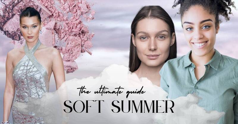
Soft Summer is a distinctive seasonal blend that combines the cool undertones of summer with the soft, muted grace of autumn. As part of the 12-season color analysis system, it helps individuals discover the shades that truly enhance their natural beauty.

Do your features exhibit a gentle, understated coolness where no single trait stands out, yet everything works harmoniously? Are you drawn to soft, subtle colors that seem to elevate your look effortlessly? Perhaps the serene beauty of a misty morning over calm waters speaks to your soul?

If you’re nodding along, you might be a Soft Summer! This is your ultimate guide to understanding Soft Summer in the 12-season color system. From physical characteristics and ideal makeup to color palettes and wardrobe essentials, we’ve got everything you need to build your perfect Soft Summer wardrobe and create a personalized palette that suits you.

FEATURES OF SOFT SUMMER

DEFINING CHARACTERISTICS

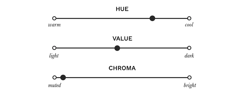
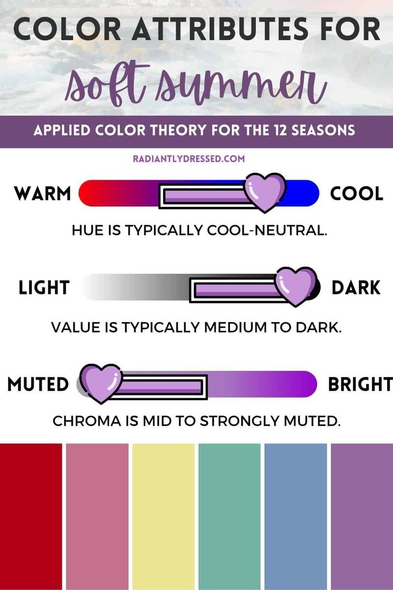
Soft Summer is defined by three key traits: a cool hue, medium value, and muted chroma. Let’s break down each of these characteristics:

  • Cool Hue: Soft Summer’s undertone is always cool, meaning it has a blue base. However, overtones of beige or yellow can sometimes give a warmer or olive appearance, which may cause confusion when distinguishing Soft Summer from Soft Autumn.
  • Medium Value: Soft Summers generally fall in the middle of the value spectrum, from light to medium-dark. Some individuals may even have such dark features that they resemble Deep Winter. These darker Soft Summers should stick to the deeper, richer muted shades within the palette to stay aligned with their season.
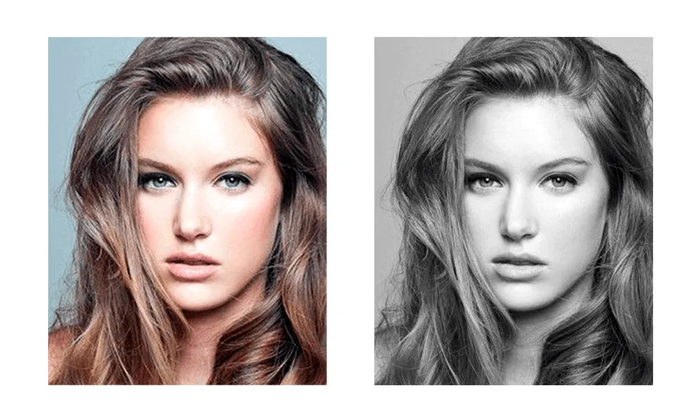
  • Muted Chroma: The defining trait of Soft Summer is its muted chroma, which refers to the lack of intense, bright colors. Everything about Soft Summer is softened, with low contrast between features like skin, eyes, and hair. Bright or saturated hues should be avoided, as they overwhelm the subtle beauty of this season.

Soft Summer holds a unique place in the color spectrum with its cool blue undertones, often tempered by beige or yellow overtones, creating a neutral yet nuanced appearance.

Unlike other summer seasons, what truly sets Soft Summer apart is its muted chroma. This refers to the soft, low-saturation quality that characterizes the skin, eyes, and hair. The overall look is less about contrast and more about a harmonious, grayed softness.

In terms of value (lightness or darkness), Soft Summer offers one of the widest ranges within the Summer family. While some may lean towards lighter tones, most Soft Summers fall in the medium-dark range, making it the darkest of all summer seasons.

SOFT SUMMER FEATURES

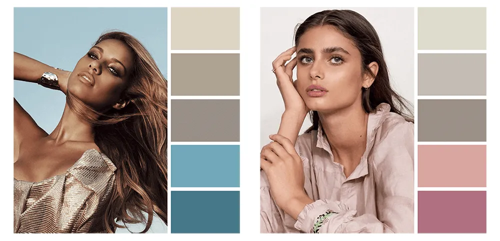
  • Skin Tone: Soft Summer skin can vary from creamy beige or ivory to dark beige. For people of color, dark beige is common, and light-skinned Black women often fit within this season as well.
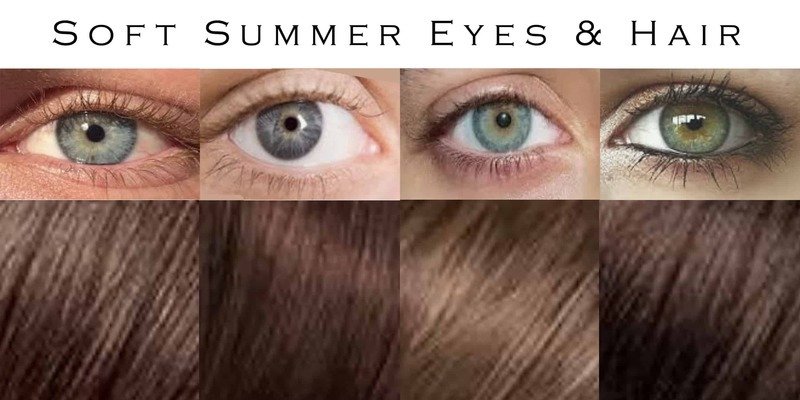
  • Eye Color: While soft blue, gray, or green eyes are frequently associated with Soft Summer, eye color can also include muted brown shades. The defining feature is the subdued quality, often showing patterns like crypts or autumnal flecks, giving the eyes depth without sharp contrast.
  • Hair Color: Hair tends to range from medium to dark brown, though lighter hair or even gray is also common. Soft Summer hair generally lacks warm highlights, often displaying an ashy, gray tone. Although hair color is less critical in determining one’s seasonal palette, it complements the overall soft, cool aesthetic of this season.

HARMONIOUS BALANCE

Soft Summer features are characterized by an overall harmony created by their muted chroma and the gentle, seamless contrast between skin, eyes, and hair. This balanced combination gives Soft Summers a soft, understated beauty that truly shines when they wear the right colors. Although their features may appear subtle or neutral at first glance, they become strikingly captivating when accentuated by the muted, cool tones that complement their natural palette.

MAKEUP FOR THE SOFT SUMMER WOMAN

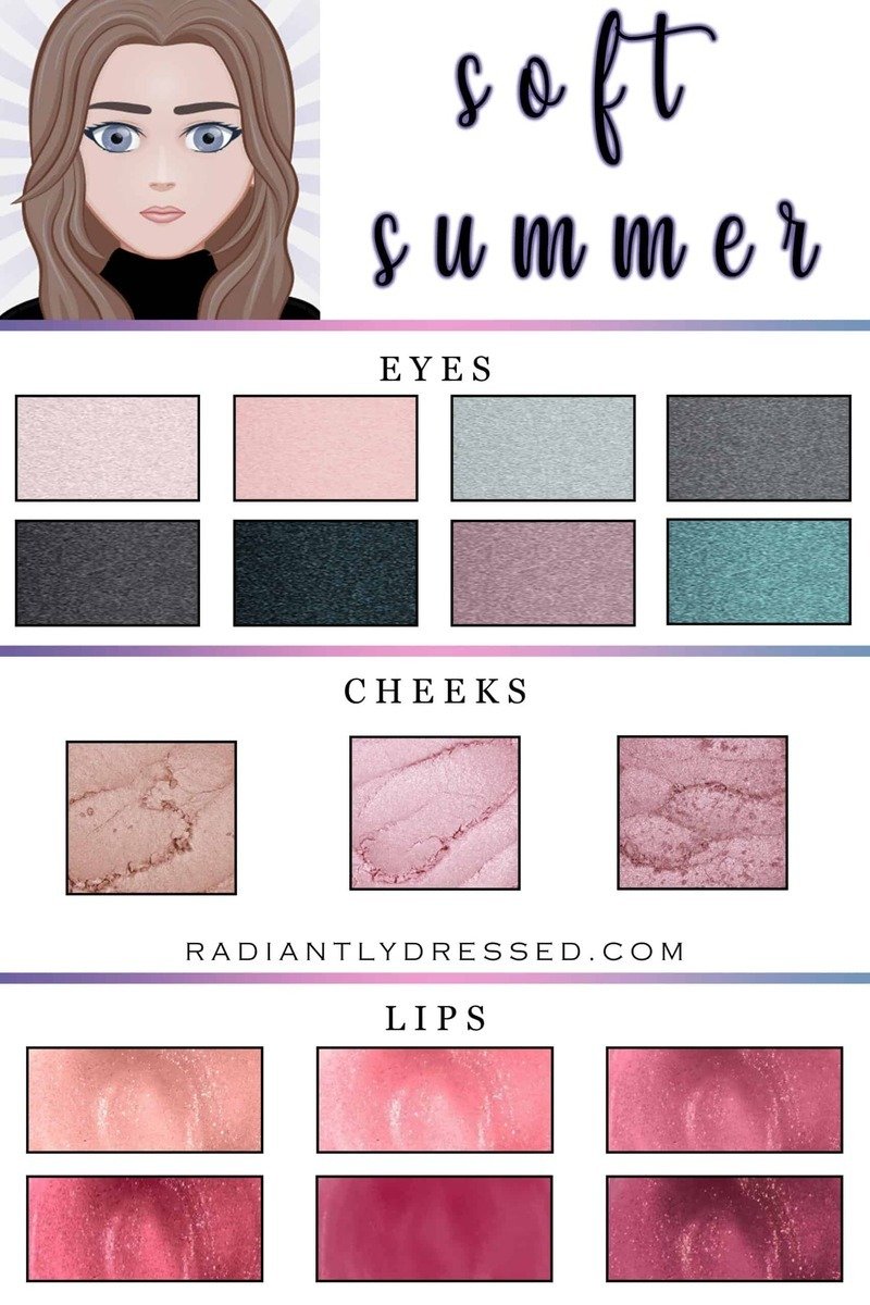
To truly enhance Soft Summer features, your makeup should align with the season’s cool and muted color palette. The aim is not just to enhance beauty, but to create a seamless harmony with your natural tones. Soft, cool shades like dusty pinks, mauves, muted lavenders, and cool browns will complement your complexion and bring out your understated elegance without overpowering your features.

To enhance your Soft Summer look, choose light neutrals like icy pink, blush, and dusky blue for an effortless, everyday vibe. For more dramatic occasions, opt for rich shades such as charcoal or navy. If you want to add an unexpected pop of color, soft plum or warm teal are perfect accent hues.

When it comes to cheeks, neutral cool shades are your best friends. Look for soft hues like sand, soft pink, or rose to create a creamy, glowing complexion that aligns with the Soft Summer aesthetic.

For lips, nude tones work beautifully, along with blush pink and mauve. If you want to go bold, choose cooler shades like rose, berry, or plum.

Avoid warm tones that clash with your natural coloring, such as fiery reds, oranges, and yellows for your eyes, or bronze shades for the cheeks. Steer clear of overly dark lip colors, which can create a harsh contrast and disrupt your natural softness.

INSPIRATION: THE NATURAL BEAUTY OF SOFT SUMMER

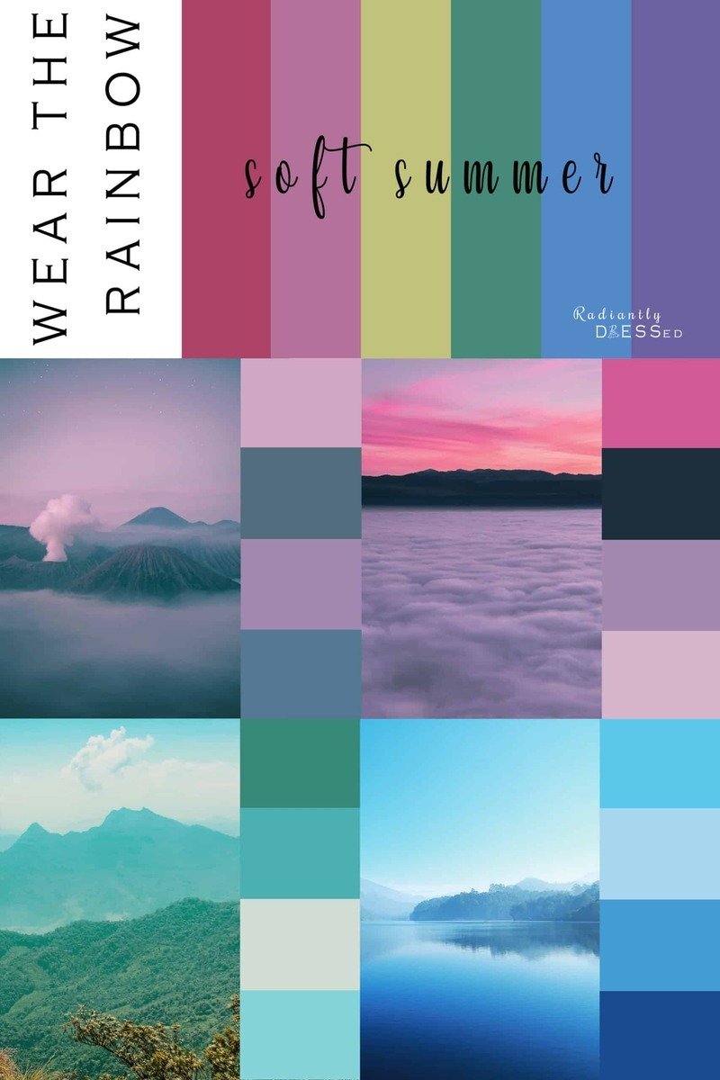
Soft Summer is more than just a seasonal color type; it embodies an aesthetic deeply connected to the natural world. Its palette draws inspiration from the calming hues of misty mornings, serene oceans, and soft sunsets, showcasing the beauty created by the greatest Creator (Genesis 1:31).

Picture a foggy dawn over still waters—the cool grays and muted blues reflect Soft Summer’s essence. This color range includes gentle tones of gray, blue, purple, pink, and understated red.

Ocean Views: Soft Summer echoes the soft beauty of an island volcano veiled in pink and purple fog, blending seamlessly with the tranquil sea.

Mountain Scapes: A pink sunset fading into lavender mist over subdued green mountains captures the cool, muted vibe of this season.

Wintry Waters: A wintry lake scene, showcasing various muted blues, further illustrates Soft Summer’s peaceful, soft color profile.

Soft Summer’s palette is a reflection of the earth’s natural harmony, blending delicate, muted beauty with the tranquility of nature.

SOFT SUMMER COLOR PALETTE

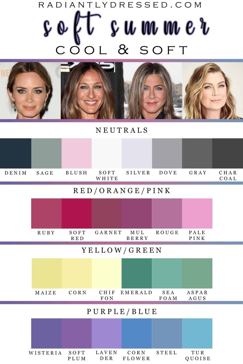
When building a color palette for Soft Summer, start with versatile neutrals before exploring a range of colors.

Charcoal and denim are softer alternatives to harsh black, while a muted soft white works better than bright white. Add foundational shades like sage, blush, and dove gray to your wardrobe for a balanced look.

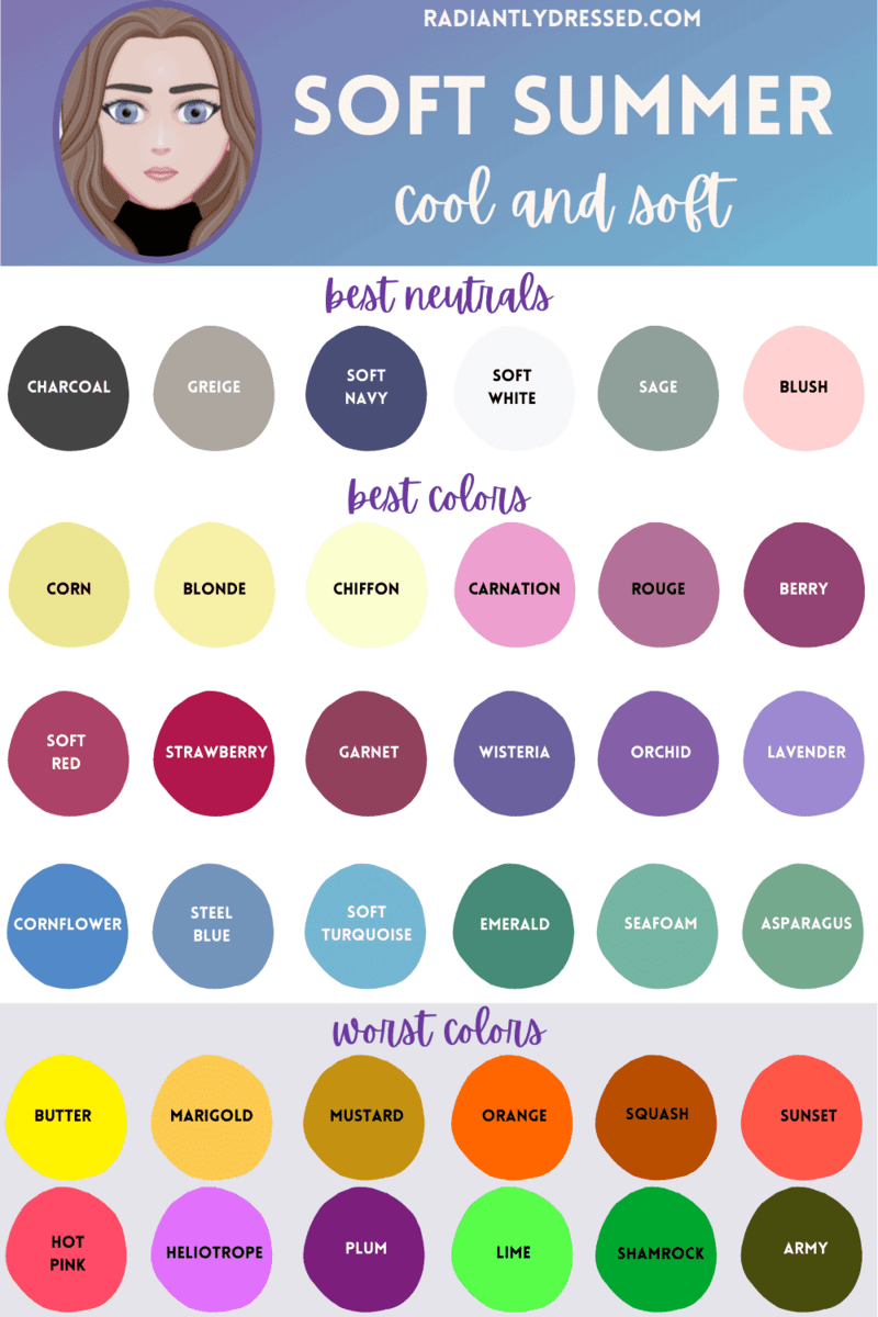
For reds, choose cool shades like ruby or soft red, and skip orange since it’s too warm. Stick to cooler yellows, such as corn or chiffon. Greens should have a touch of blue and stay in the medium range. Soft Summers can enjoy a variety of blues, from purple-blues to green-blues. Finish off with purples that have cool undertones.

Although every color may have a version that works for Soft Summer, some are harder to match. Cool pinks can sometimes look more like purples, many reds may appear too warm, and yellows without a green tint are often too warm. Blues and purples leaning more toward blue rather than red will flatter Soft Summers best.

It’s important to avoid certain colors, like stark black and white, which create harsh contrast. Bright, saturated shades can overwhelm Soft Summer’s natural softness. Medium pastel colors like rouge and steel blue are ideal choices.

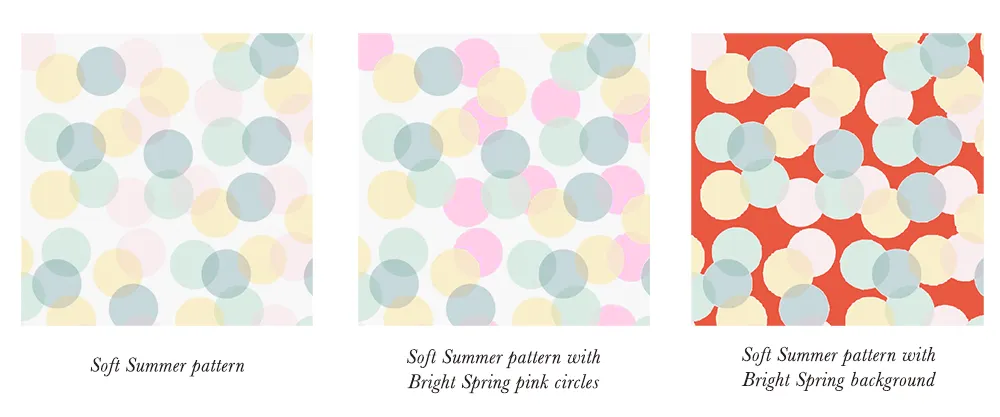
Lastly, be cautious with colors from other seasonal palettes. Bright Spring, Bright Winter, and Warm Spring shades are often too vivid, warm, or high-contrast for Soft Summer, making them less harmonious with your natural tones. Stick to muted, cool shades for a balanced and flattering look.

CHOOSING PRINTS FOR SOFT SUMMER

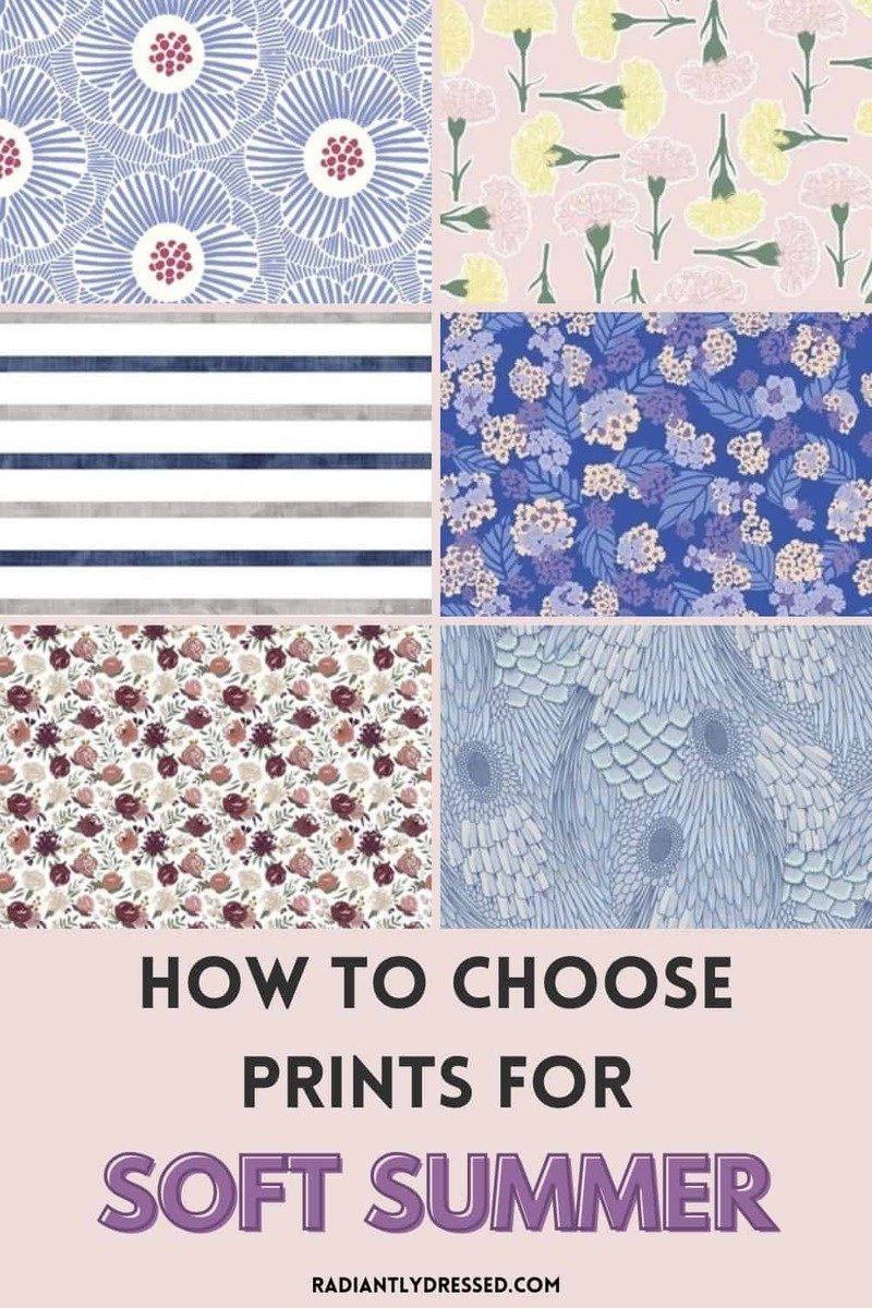
Choosing the right prints is key to enhancing your Soft Summer look. To make sure your prints work with your color palette and personal style, consider the following:

  • Color Consistency: Ensure that at least 90% of the colors in your print come from the Soft Summer palette. This keeps your look cohesive and harmonious.
  • Scale: Opt for small to medium-sized prints. Large prints can feel overwhelming and take away from the soft, balanced nature of Soft Summer.
  • Contrast Level: Stick with low-contrast prints. Soft Summer looks best in muted, blended patterns that reflect its subtle and gentle charm.

Following these guidelines will help you choose prints that enhance your wardrobe and boost your confidence.

WARDROBE ESSENTIALS FOR SOFT AND COOL COLORING

No matter your style, there are a few key items every woman should have in her wardrobe.

Start with neutral basics, as they are the foundation of any outfit. Sticking to similar neutral shades creates a cohesive and polished look. Layering different tones of the same color adds depth and a luxurious feel.

If you prefer a more colorful style, neutrals are still essential, but you can bring in personality with vibrant accessories. Adding fun pieces in shades of pink, green, purple, or blue can give your outfits an exciting pop of color while still looking put together.

CONCLUSION

The Soft Summer color palette offers a refreshing and timeless aesthetic that suits a wide range of individuals. Its soft, muted tones create a harmonious and sophisticated look. By understanding your undertones and incorporating these colors into your wardrobe, you can enhance your natural beauty and radiate confidence. Don’t be afraid to mix and match different shades and textures to create your unique style. With a little creativity and confidence, you can effortlessly rock the Soft Summer look and feel your best.

20 DREAMY PASTEL NAIL DESIGNS YOU NEED TO TRY

Spring has arrived, bringing with it some of the year’s most stunning nail colors. This season, milky pastel hues are stepping into the spotlight, offering creamier and more muted alternatives to classic pastels. Get ready to embrace lighter shades like buttery baby pink, pearly light lavender, and cool mint green. Plus, exciting nail designs are making waves, featuring gradient tips, funky French styles, and dreamy accents that elevate the traditional manicure. Ahead, explore our favorite pastel nail ideas for this spring—trust us, these inspirations will ignite your creativity for your next mani!

BARBIE PINK PASTEL

What do you get when you combine baby-pink French tips with glittery Barbie-pink accents? A manicure dream come true! This flirty and cute design is perfect for any occasion.

PASTEL CHROME

Is there anything better than pastel chrome nails? We think not! This stunning nail design combines two of our favorite elements, resulting in beautiful shades that shimmer and shine in the light.

PASTEL SUNSET DESIGNS

I’ll fully admit that this design isn’t the easiest and may require a professional nail technician, but it’s so dreamy that I couldn’t leave it off the inspiration board. If you decide to try it yourself, incorporating a subtle pop of pastel purple will create a stunning sky-like effect.

TANGERINE ORANGE

If you’re looking to sport orange nails without going too bold, we have the perfect solution. This pastel orange shade is bright yet subtle, making just the right statement without being overwhelming.

EASTER EGGS

Can’t decide on just one color? Why not choose them all! This adorable manicure showcases the best shades of spring, bringing them together in perfect harmony.

BABY BLUES

In our opinion, sky blue is one of the most beautiful colors on the color wheel. It’s dainty, chic, and sophisticated, effortlessly complementing a variety of shades. This lovely design strikes the perfect balance between being aesthetically pleasing and a touch adventurous.

MILKY LAVENDER WITH FLOWER ACCENTS

Milky lavender is one of the season’s hottest hues, and it’s easy to see why. This soft shade beautifully bridges the gap between deep winter tones and vibrant summer colors, making it incredibly versatile. Plus, the floral accents are perfect for spring!

DOUBLE-FRENCH PASTEL TIPS

As the saying goes, two is better than one! This double French tip design lets you showcase your two favorite shades right at your fingertips. Experiment with combinations like pink and yellow, blue and purple, or green and orange—the possibilities are endless!

GEOMETRIC SHAPES WITH METALLIC ACCENTS

Incorporating geometric shapes with metallic accents is a chic way to elevate pastel colors and give them a modern twist.

CLOUDY SKIES

If you lean towards neutral, muted colors but still want something fun for spring, consider this cloudy gray shade. It features a subtle blue undertone without being overly bright. The best part? This manicure pairs beautifully with any outfit.

BLUE-AND-PINK GRADIANT DESIGNS 

This design may look more complicated than it actually is. You can easily DIY your own gradient-style nails by applying your chosen colors to a sponge and gently dabbing them onto your nails until you achieve your desired hue.

COOL MINT GREEN

Bright, cheerful, and often underrated, mint green is a shade we wholeheartedly embrace. While lime-green nails dominated last year, 2024 is shifting towards more muted hues that offer a subtler charm. Count us in!

OMBRÉ PASTEL FRENCH TIPS

Ombré French tips in a monochrome palette offer a playful twist on pastels.

REVERSE FRENCH PASTEL NAILS

Why settle for just one color when you can flaunt them all? This reverse French rainbow pastel manicure is as cute as it gets. Plus, even as your nails grow out, they’ll continue to look fabulous.

RAINBOW PASTEL GRADIENT TIPS

Elevate your nail game with this chic pastel gradient style. While the gradient may be subtle from a distance, it reveals a delightful surprise that’s sure to earn you endless compliments. Plus, the rainbow hues provide the perfect pop of color!

PASTEL YELLOW SQUIGGLES

Sure, this design requires extra commitment, but if you can pull it off, it will be 100% worth it. Be sure to use a super thin brush to achieve the best results for a look like this.

LEMON YELLOW

We must admit, we don’t see yellow manicures as often as we’d like. This cheerful hue is both bubbly and tasteful, making it a dreamy shade for any season.

LIGHT PINK TIPS

Timeless, classic, and always in style, you can never go wrong with a French manicure. To give it a spring twist, choose light pink tips. If you’re feeling particularly adventurous, add a fun design to your thumbs for an extra flair!

SHADES OF BLUE & WHITE

If you’re aiming for a softer blue-toned look, consider these pastel hues paired with subtle whites and grays to really make the colors pop.

PASTEL FLORAL DESIGNS

Before you hit me with a Devil Wears Prada quote, just take a look at how adorable this little floral design is atop a lilac nail shade! You really can’t argue with that.

CONCLUSION

In conclusion, pastel nails are a versatile and timeless choice that effortlessly elevate any manicure. Whether you prefer soft pinks, calming blues, or muted yellows, pastel shades can complement any style and occasion. With endless design possibilities—ranging from minimalist looks to intricate patterns—pastel nails allow for personal expression while embracing the refreshing spirit of the season. So go ahead, indulge in the soft hues and let your nails make a charming statement!