Nature’s colors flow organically—they are not confined to a strict, linear progression, much like the color wheel itself. In the world of color analysis, we use these hues to elevate our clients’ moods, broaden their expressions, and refresh their spirits. Once your color analyst identifies your personal color space from one of the 12 categories, you’ll receive a book of colors tailored just for you, guiding your wardrobe and choices. You begin to live and breathe these colors.
But what if you venture beyond the lines? What if you dare to step outside your designated color space? I often do! Once you understand the three dimensions of color and how they interact with the 12 core tones, you’ll realize that each tone has a natural counterpart, sharing defining characteristics that remain fairly consistent.
So, if you’re ready to push your color boundaries, here are your cliff notes for exploring new possibilities:
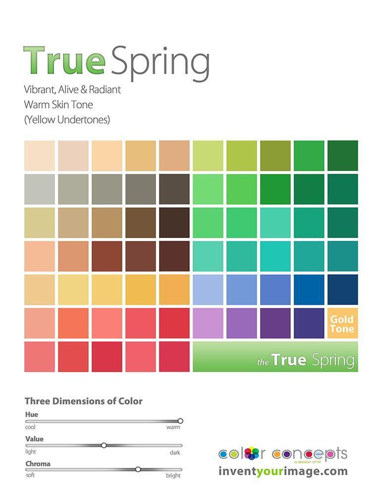

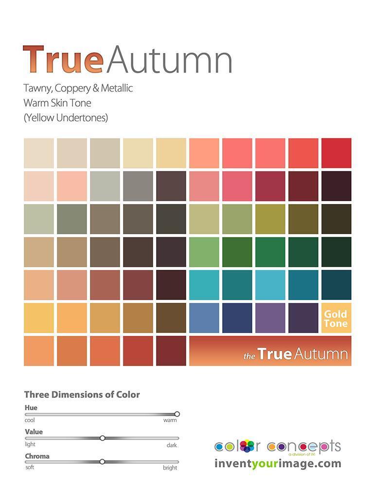
It’s easy to see, when looking at the pictures and the continuum of color dimensions, that their common thread is warmth. Whether it’s a vibrant red, a golden yellow, or a rich orange, these colors share an inherent warmth that connects them across different spaces. This warmth can evoke feelings of energy, comfort, and enthusiasm, making them a natural choice when you want to add vibrancy or emotion to your wardrobe or environment.
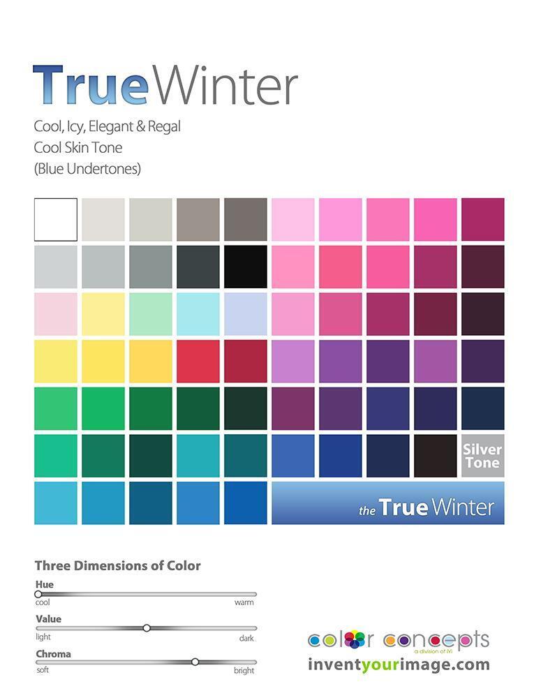
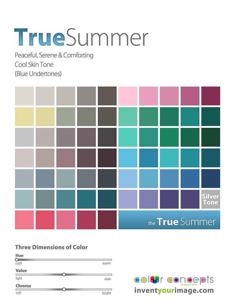
In these two color spaces, we see a shared characteristic in their cool hues. These cool tones, like blues, greens, and purples, have a calming, serene effect, bringing a sense of tranquility and depth.
Now, when we move to the neutral color spaces, things become a bit trickier. The counterparts in these spaces don’t always share the same vibrant or easily definable traits as the cool or warm tones. Neutral tones, such as grays, browns, and soft beiges, are more subtle, often blending and adapting to their surroundings. Translating their similarities across different spaces can be more nuanced, but once you understand the underlying balance of warm and cool undertones within the neutral spectrum, you’ll see how they relate to each other in terms of tone and depth.
So, let’s dive into the neutral spaces and explore how these counterparts align:
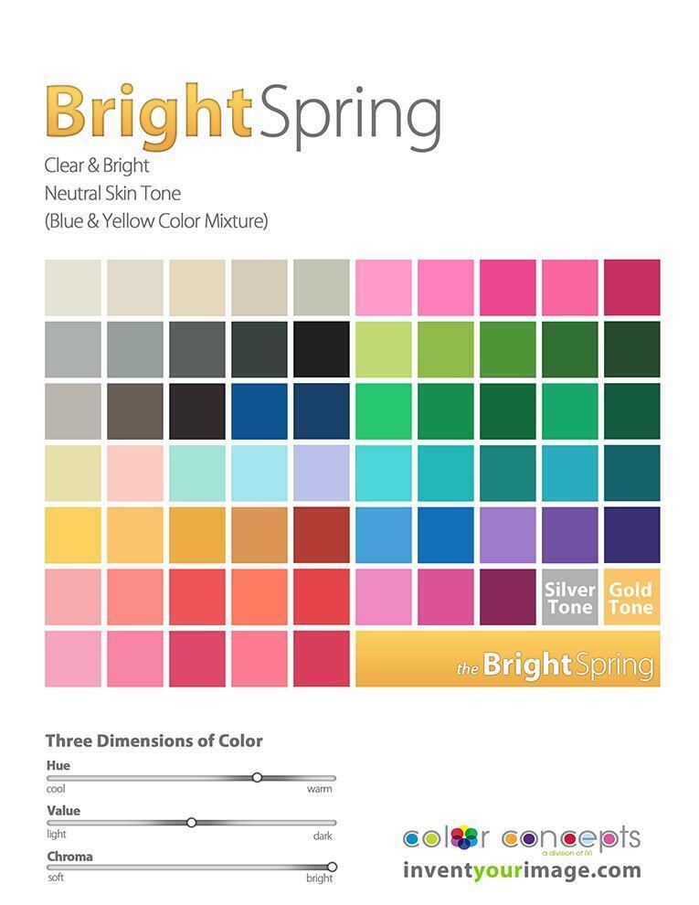
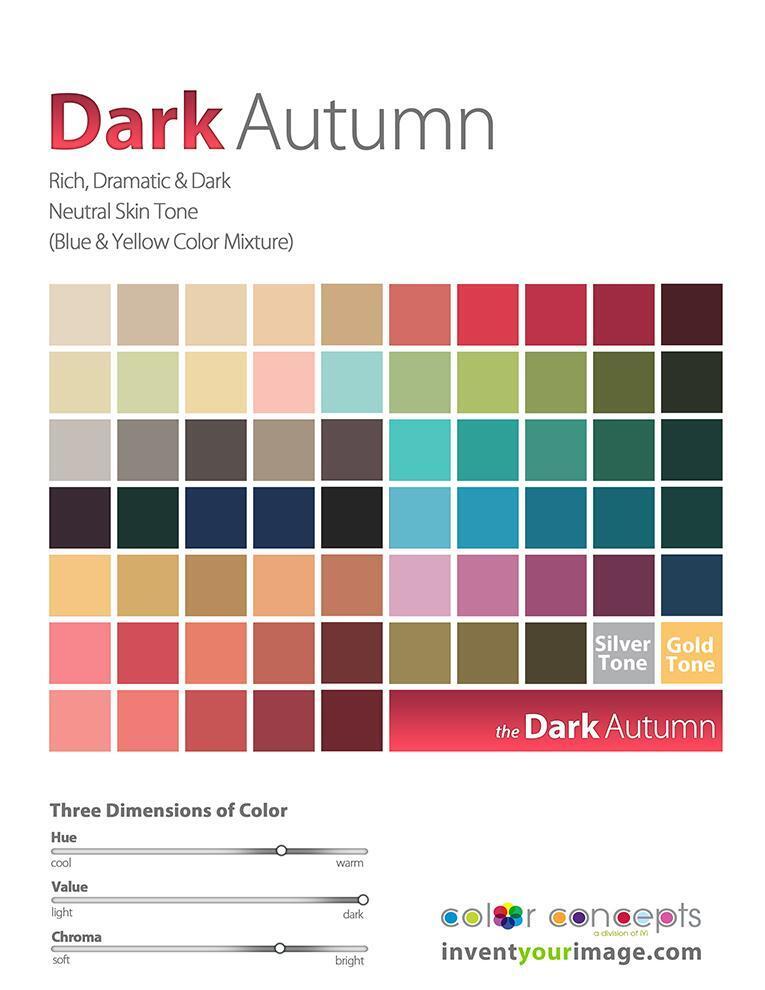
Both of these color palettes shift towards the warm side of their neighboring true seasons, as seen in the color continuums (referencing the pictures). They also highlight the brightest and darkest tones within their categories. It’s interesting to note that, without knowing much about color analysis, I find myself naturally drawn to both of these palettes. While I am a Bright Spring (BSp), I am particularly attracted to the Dark Autumn (DA) colors. Even more interesting, my husband and two boys are all Dark Autumns as well. Coincidence? I think not!
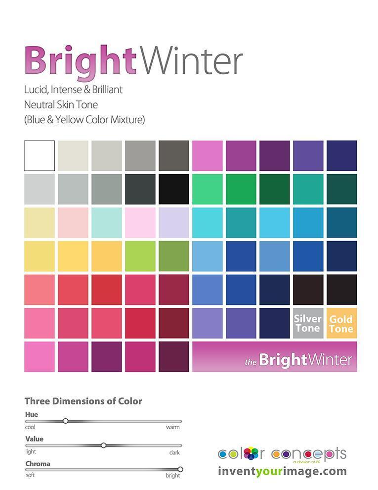
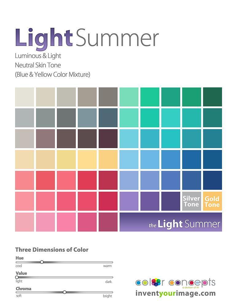
Now it’s your turn to think about the commonality they both share. Here’s a hint: consider the three dimensions of color scales. Got it? The key commonality is that the hue is the same. Both palettes lean toward the cool side of their true season, with a focus on the lightest and brightest tones in their group. This creates a fresh, crisp, and vibrant feel that unites them, even if they belong to different seasonal categories. The coolness and brightness are what make them stand out within their respective groups.
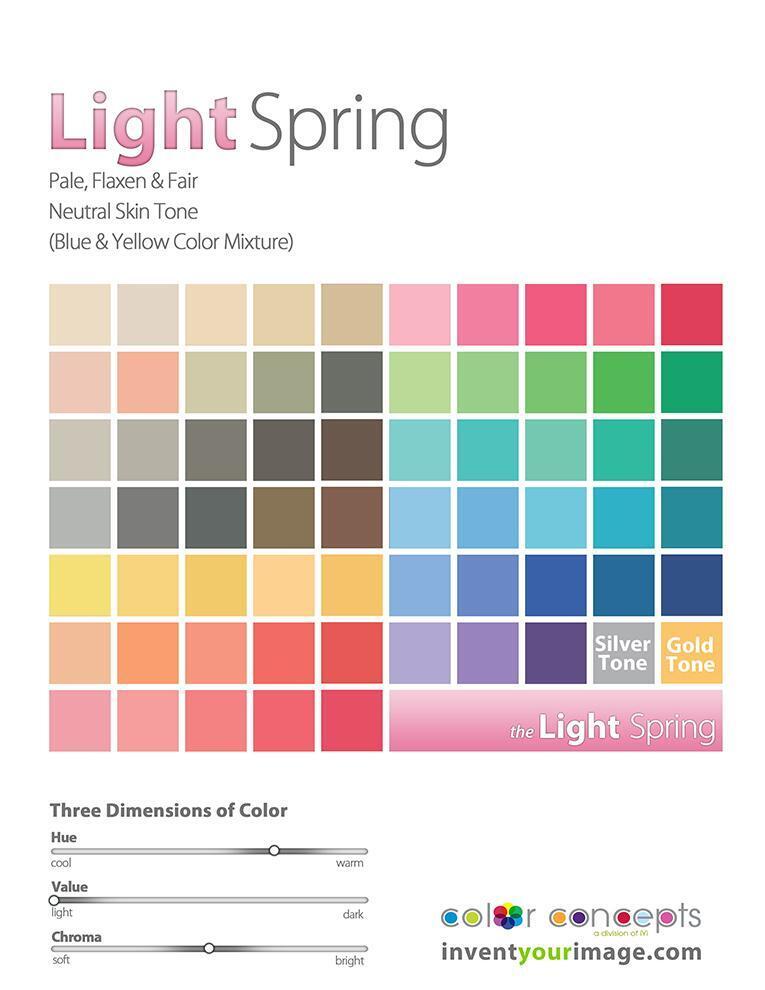
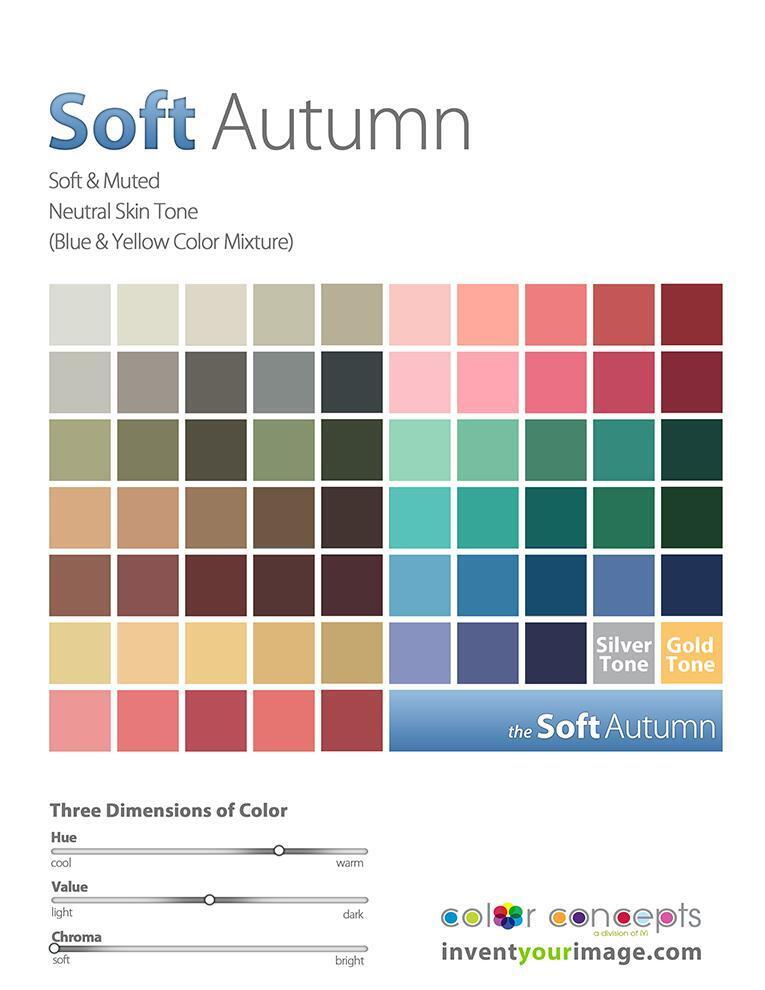
In this pairing, both palettes lean towards the warm side of their true season. They also represent the lightest and softest tones within their respective seasons, creating a gentle, harmonious effect. These softer, warmer hues embody a sense of warmth and calm, offering a more delicate and subtle approach to color that still reflects the essence of their season.
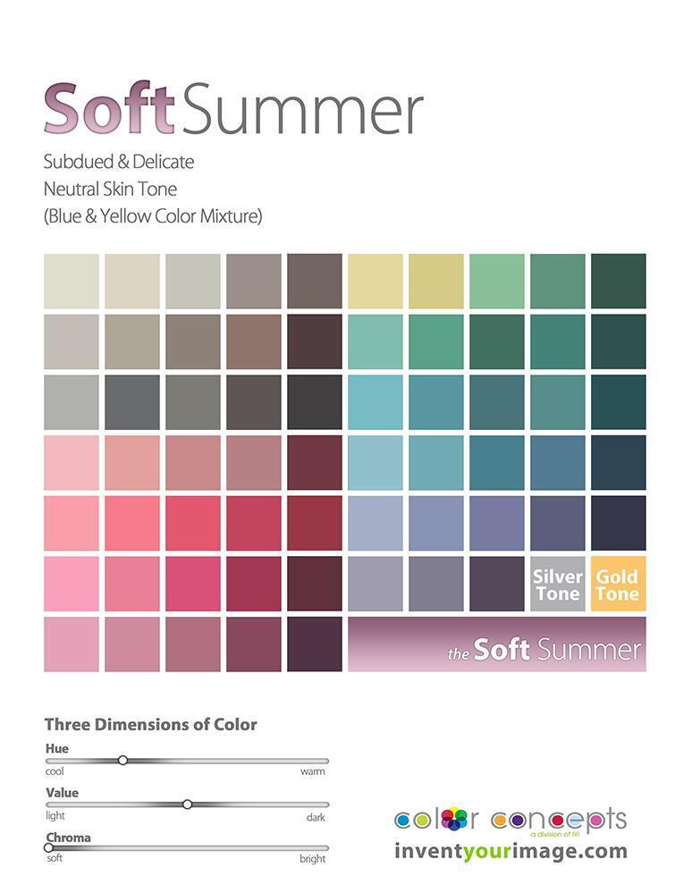
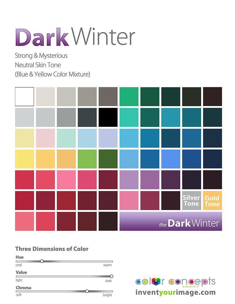
In the last pairing, both palettes lean towards the cool side of their true season. They are also the softest and darkest tones within their respective season groups, creating a more muted, refined feel. These colors offer depth and sophistication, while still maintaining the cool essence of their season, providing a rich yet understated look.
CONCLUSION
In conclusion, the exploration of these color pairings reveals the fascinating way that hues, warmth, and coolness interact within each season. By understanding the three dimensions of color—hue, value, and chroma—we can see how each palette has its own unique characteristics that reflect the essence of its true season. Whether leaning toward warmth or coolness, light or dark tones, each color grouping offers a distinct way to express personality, mood, and style. Ultimately, color analysis not only helps us define our personal palettes but also allows us to connect more deeply with the colors that resonate with us naturally. So, whether you stick to your designated season or venture into neighboring ones, there’s no wrong way to embrace the power of color.

