
Discover the allure of Colonnade Gray, a versatile and sophisticated shade that effortlessly enhances any interior space. This classic gray hue, brought to you by Sherwin-Williams, offers a harmonious blend of warmth and coolness, making it an ideal choice for creating both modern and traditional environments. In this comprehensive guide, we’ll delve into the captivating qualities of Colonnade Gray, exploring its versatility, color pairing potential, and its ability to elevate your home’s aesthetic. Whether you’re seeking a serene bedroom retreat or a stylish living room ambiance, Colonnade Gray promises to deliver a timeless and elegant touch.
SHERWIN WILLIAMS COLONNADE GRAY SW 7641 DETAILS AND SPECIFICATIONS

Before painting the walls of your home or office, it’s essential to understand the color theories behind your choices. This not only helps you select the perfect shade but also determines which colors will complement it best. Whether you’re painting an accent wall or the moldings and trims, knowing the RGB values and Light Reflectance Value (LRV) is crucial. Colonnade Gray, for example, has an LRV of 53.

This makes it a true mid-tone color, offering a balance of neither too much darkness nor brightness. Since paint colors can appear differently depending on the lighting and environment, I recommend testing Colonnade Gray at home with a peel-and-stick sample from Samplize.
Now that you have this information, you’ll know that Colonnade Gray works beautifully in larger or medium-sized rooms. Oops, did I let the secret slip? There’s more to uncover, but first, let’s look at the associated RGB values:
Red = 198, Green = 192, Blue = 182
HEX Value = #c6c0b6
HOW DOES COLONNADE GRAY FEEL IN A SPACE?
In the photo above, you can see how Colonnade Gray beautifully complements rich hardwood floors and stark white moldings. It adds a crisp, warm, and cozy touch to any space. The color strikes a perfect balance—not too dark and not too light—offering flexibility without many restrictions.
Colonnade Gray proves to be both versatile and aesthetically pleasing. When exposed to natural light, it reveals its lighter side, making rooms appear bigger and brighter. Pairing it with white trims further enhances the depth and warmth of the color, creating a harmonious blend.
Without direct light, Colonnade Gray leans more toward a true gray. However, with ample lighting, it softens into a warmer, beige-toned hue. This dynamic quality makes it an excellent choice for those looking to avoid static, monotonous wall colors.
So, if you’re tired of your walls always looking the same, Colonnade Gray offers a classic, versatile solution that brings subtle shifts depending on the lighting. It’s definitely worth considering for your next paint project!
HOW DOES LIGHT AFFECT THE COLOR?

When paired with whites, SW Colonnade Gray exudes a soft and smooth elegance that’s hard to ignore. It’s truly versatile!
The chameleon-like quality of this color can make it tricky to pin down, as it tends to shift depending on the lighting. In south or west-facing rooms, Colonnade Gray often appears lighter, while in north-facing rooms, it can take on a deeper, darker tone.
This shade is a popular choice for living and family rooms, as it adds a cozy, inviting warmth. However, the beauty of Colonnade Gray lies in its flexibility—there are no strict rules for where or how to use it.
To make sure it’s the perfect fit for your space, I highly recommend testing a peel-and-stick wall sample at home. It’s the best way to see how the color will interact with your specific lighting and environment.
WHAT ARE THE COORDINATING COLORS FOR SHERWIN WILLIAMS COLONNADE GRAY?
If you’re thinking about using Colonnade Gray in your home, I have a few recommendations to help you make the most of this versatile shade.
For those who love a monochromatic style, here’s a list of colors that pair beautifully with Colonnade Gray:
- SW Modern Gray
- SW Skyline Steel
- SW Pussywillow
If you prefer more contrast and pops of color, a complementary theme could be the way to go. Here are a few colors I recommend:
- SW 0023 Pewter Tankard
- SW 9044 Little Blue Box
- SW Origami White

For trims and moldings, I highly recommend using White Reflectance or Pure White—both of which complement a wide range of colors. Pure White is a personal favorite of mine!
Colonnade Gray also pairs wonderfully with wooden textures. If your dining room has a farmhouse vibe with rustic tables and chairs, this color could be the perfect choice to enhance that warm, natural feel.
SHERWIN WILLIAMS SW 7641 COLONNADE GRAY VS. SIMILAR COLORS
If you’re exploring other alternatives, there are plenty of great options to consider. Whether you’re looking for light or dark tones, or cool to warm undertones, there’s a variety to choose from.
A standout alternative is Skyline Steel, offering a similar feel. Another excellent option is BM Revere Pewter, which provides a beautiful, versatile look.
While I’ve recommended these shades as part of a monochromatic palette, they also serve as strong alternatives to Colonnade Gray.
COLONNADE GRAY VS. SKYLINE STEEL

With an LRV of 52, this color offers a similar level of brightness to Colonnade Gray. Its clean, crisp, and warm feel makes it a great alternative.
However, this shade carries a subtle reddish-brown undertone—can you spot the difference? Trust me, you’ll notice it once it’s on your walls!
To make the comparison easier, try ordering peel-and-stick samples to see how each color looks in your own space.
COLONNADE GRAY VS. REVERE PEWTER

One of Benjamin Moore’s most popular grays is Revere Pewter. Classic and crisp, it’s an excellent alternative to Colonnade Gray.
Both colors offer similar brightness and depth, sharing neutral, greige tones with subtle green undertones, just like Colonnade Gray. However, Revere Pewter has a more earthy quality, making it perfect for farmhouse, rustic, or contemporary interiors.
If your home features rich hardwood floors, either color would complement the space beautifully. Pair them with white door and window frames for a warm, inviting touch.
Don’t forget to grab real-time samples to see how the paint’s tonality works with your home’s lighting!
WHERE TO USE SHERWIN WILLIAMS COLONNADE GRAY YOUR HOME?
COLONNADE GRAY IN BEDROOMS
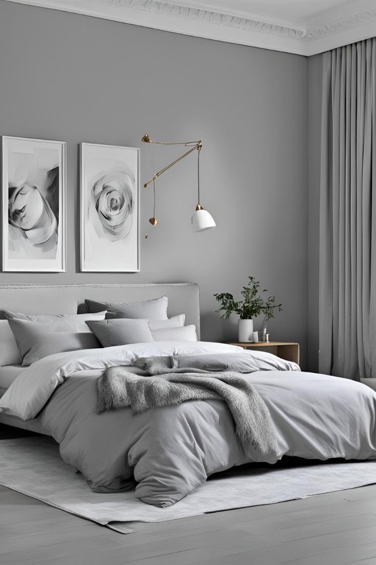
Blogger Jennifer chose Sherwin Williams Colonnade Gray for her bedroom, and it’s a fantastic choice for creating a personal, serene space. If you appreciate subtlety, smoothness, and tranquility, this color is highly recommended.
To achieve a perfect look, pair it with a wooden headboard, matching side tables, and a rustic floor lamp. However, if your style leans towards Scandinavian or Minimalist, this color might not be the best fit.
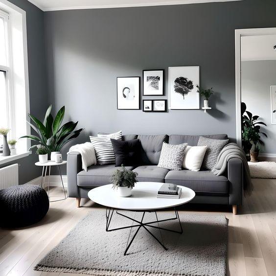
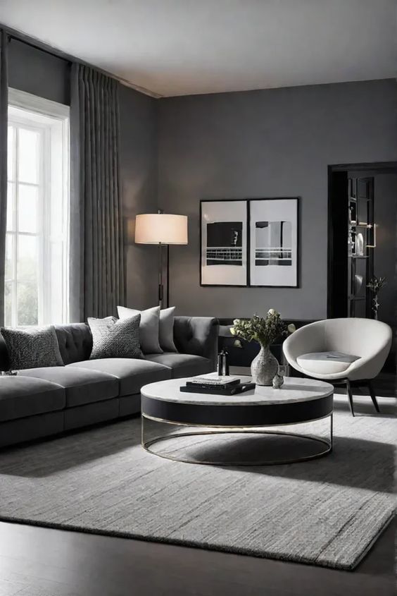
USING IN LIVING ROOMS
Looking to create a cozy and comfortable space for relaxing with your family over coffee in the evening? Painting your living room walls in Colonnade Gray will help you achieve just that.
Pair it with a sleek, modern black fireplace for a stylish touch. However, if you have an exposed brick fireplace, Colonnade Gray might not be the best choice—it could clash and detract from the overall look.
COLONNADE GRAY IN KITCHENS
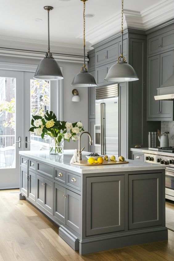
For a subtly stylish kitchen, Colonnade Gray is an excellent choice with its crisp and clean appearance. However, if you have an artsy backsplash, you might want to consider other colors.
On the plus side, if you’re planning to use distressed, exposed wooden shelves, Colonnade Gray is a perfect match and will enhance the rustic charm beautifully!
COLONNADE GRAY ON EXTERIORS

As I always say, colors tend to appear lighter when used on exteriors. Colonnade Gray presents a clean, fresh look that is especially suited for northern climates. For a polished finish, pair it with white frames, trims, and moldings. And don’t worry—stone wainscoting complements this color beautifully!
CONCLUSION
Colonnade Gray, a timeless and versatile hue from Sherwin-Williams, offers a sophisticated and enduring solution for your interior design needs. Its balanced blend of warmth and coolness makes it a harmonious choice for a wide range of spaces, from modern to traditional.
By exploring its versatility, color pairing potential, and its ability to create a serene and elegant atmosphere, you can confidently incorporate Colonnade Gray into your home. Whether you’re seeking a minimalist aesthetic or a cozy retreat, this classic gray shade is sure to elevate your interior design and provide a lasting sense of style.


